Replete Modal Documentation
- Created: 20/08/2021
- By: ThemeSelection
Replete Modal is a user-friendly, fully customizable, responsive jQuery popup modal to take any HTML content, including images, videos, SVG icons,forms and display it in a clean organized and responsive popup. It is easy, flexible, powerful to create professional looking popup modal. This plugin features plenty of layouts, CSS transitions, 9 Position, 40+ animations, 5 Overlay, 10 Modal Layouts, 10 Modal Types, 35+ SVG Icons and much more.
If you have any questions that are beyond the scope of this documentation, please feel free to email via my user page contact form here.
Integration
- Download the zipped pack from ThemeSelection and extract to a folder on your computer.
- You need to include necessary css and js files to your project.
<link rel="stylesheet" href="css/animate.css">
<link rel="stylesheet" href="css/replete-modal.css">

<script src="http://ajax.googleapis.com/ajax/libs/jquery/1.12.0/jquery.min.js"></script>
<script src="js/replete-modal.min.js"></script>
- Copy code of any example modal.
- Replace demo content with yours.
Script structure
The script structure of the modal is very easy. Add arguments and it's value according to requirement.
$('.className').on('click',function(){
	rplm({
		title: "Title Goes Here",
		text: "Any Content Or HTML structure",
		html: true,
		showCancelButton: true
	});
});
Here, rplm({ ... }); is required to use for Replete Modal.
Modal Configuration
There are many configuration for replete modal. To use any of them, you need to add the appropriate argument to the script. All available configuration options listed in the table below.
| Configuration | Default Value | Description |
|---|---|---|
| title | null(required) | The title of the modal. It can be added to the object under the key "title". |
| text | null | A description for the modal. You can also add full html content like form, heading, paragraph, etc. When you set image tag inside text please add height of the image so that pop up will get exact height of the pop up. For Example: <img src='..' height="XXX" /> |
| type | null | The type of the modal. Replete Modal comes with 4 built-in types which will show a icon animation: "warning", "error", "success", "info" and "map". You can also set it as "input" to get a prompt modal and set it as "map" to get google map. |
| allowEscapeKey | true | If set to true, the user can dismiss the modal by pressing the Escape key. |
| allowOutsideClick | false | If set to true, the user can dismiss the modal by clicking outside the modal. |
| backgroundScroll | false | Set to true to scroll background of the modal. |
| width | 478px | Default modal width is "478px". You can set custom width for your modal in pixels. |
| Button Configuration | ||
| showCancelButton | false | If set to true, a "Cancel" button will be shown, which the user can click on to dismiss the modal. |
| showConfirmButton | true | If set to false, the "OK/Confirm" button will be hidden. Make sure you set a timer or set allowOutsideClick to true when using this, so user can't get confuse. |
| confirmButtonText | OK | Use this to change the text on the "Confirm" button. If showCancelButton is set as true, the confirm button will automatically show "Confirm" instead of "OK". |
| confirmButtonColor | #4ECDC4 | Use this to change the background color of the "Confirm" button[in HEX value] |
| cancelButtonText | Cancel | Use this to change the text on the "Cancel" button. |
| showLoaderOnConfirm | false | Set to true to disable the buttons and show that something is loading. |
| closeOnConfirm | true | Set to false if you want the modal to stay open even if the user presses the "Confirm" button. This is especially useful if the function attached to the "Confirm" button is another Modal. |
| closeOnCancel | true | Same as "closeOnConfirm", but on close "Cancel" button. |
| Close Icon/Text Configuration | ||
| showCloseButton | false | Set to True if you want to show close icon(X)/text(close) on Top Right corner of the Modal. |
| closeButtonText | null | Close Button On the Top Right side of the modal. Use this to change the text of close button. |
| closeButtonColor | black | Close button text color can be "black" or "white". |
| closeButtonWithInModal | false | Set to true to show Close button, on top right corner, inside the Modal. |
| Set SVG Icons | ||
| svgIcon | null | You can set SVG Icons to display animated Icons on Replete modal. Here is list of all SVG icons name. |
| Icon on modal | ||
| imageUrl | null | Add a customized icon for the modal. Should contain a string with the path to the image. |
| imageSize | 80x80 | If imageUrl is set, you can specify imageSize to describes how big you want the icon to be in px. Pass in a string with two values separated by an "x". The first value is the width, the second is the height. |
| Set Timer | ||
| timer | null | Auto close timer of the modal. Set in milliseconds. |
| HTML Content | ||
| html | false | If set to true, will not escape title and text parameters. For Example, If you added html tags in text argument then you need to set this true. |
| Animation Configuration | ||
| animation | true | If set to false, the modal's animation will be disabled. Possible values : pop (default), fadeIn, swing, etc. Here are more options of animation. |
| Modal Positions | ||
| position | center | Positions of the modal on the screen. Possible values : topLeft,bottomRight,etc. Here are more options of positions. |
| Modal Overlay Configuration | ||
| overlay | default | Background overlay styles. Possible values : black, white, etc. Here are more options of overlay. |
| customOverlayColor | #46B9B1 | If you set overlay to "custom", You can set your own custom color for Overlay. |
| Delay & Duration | ||
| delay | null | Time to delay modal open in seconds. |
| duration | null | Set number of seconds should take to open modal. |
| Modal Layout Configuration | ||
| modalNOverlay | null | Set modal layout changes using values : white, black, etc. Here are more options of Modal. |
| allowPadding | true | This option will allow padding to modal. Set it "false", if you don't want padding to modal. |
| customModalColor | #8CD4F5 | If you set modalNOverlay to "custom", You can set your own custom color for Modal. |
| Default Input Configurations | ||
| inputType | text | Change the type of the input field when using type: "input" (this can be useful if you want users to type in their password for example). |
| inputPlaceholder | null | When using the input-type, you can specify a placeholder to help the user. |
| inputValue | null | Specify a default text value that you want your input to show when using type: "input" |
| Map Configuration | ||
| lat | 0 | If you set type="map" then use "lat" to set latitude. |
| lng | 0 | If you set type="map" then use "lng" to set longitude. |
| zoom | 8 | If you set type="map" then use "zoom" to set zoom level of map. |
| Cookie Configuration | ||
| oneTimePopUp | false | If you set oneTimePopUp:true then this pop up will open only once until user remove cookie. |
| preventDialog | false | This will show a link below pop up like "Hide This Dialog Forever". And if anybody clicks that link, this popup will be blocked forever until user remove cookie. |
| cookieName | preventRepleteModal | You can change cookie name as per your site name also. But if you want more than one modal on same page and if you want to set cookie for all else it will override the cookie. |
| preventText | Hide This Dialog Forever | Change link text according to your choice. |
| preventDays | 2000000000 | To block cookie forever, we set "2000000000" by default. But if you want to set cookie for 30 days then please set this value to 30. |
Note: When you define custom width for your modal, you need to take care of the responsiveness of the pop up on different screen size as its coded for default width only, that is "478px".
Modal Methods
There are few simple but important methods for replete modal.
| Method Name | Example | Description |
|---|---|---|
| close | rplm.close(); | Close the currently open replete modal programatically. |
| showInputError | rplm.showInputError("Invalid Username!"); | Show an error message after validating the input field, if the user's data is wrong/invalid. |
| enableButtons | rplm.enableButtons(); | Enable user to click on the cancel and confirm buttons. |
| disableButtons | rplm.disableButtons(); | Disable user to click on the cancel and confirm buttons. It will show loading. |
How to Callback
Let's say, If you want to submit Single Value using callback :
$('.className').on('click',function(){
	rplm({
		.....
		.....
	}, function(){
		email = $('.rplm-alert .email').val();
	});
});
If you want to submit Serialized Form Fields using callback :
$('.className').on('click',function(){
	rplm({
		.....
		.....
	}, function(){
		$('.rplm-alert form.login').serialize();
	});
});
If you want to submit Form using callback :
$('.className').on('click',function(){
	rplm({
		.....
		.....
	}, function(){
		$('.rplm-alert form.login').submit();
	});
});
If you want to use callback on submit & Cancel :
$('.className').on('click',function(){
	rplm({
		.....
		.....
	}, function(isConfirm){
		if (isConfirm) {
			// Confirm Callback
		}
		else{
			// Cancel Callback
		}
	});
});
If you want to submit data using AJAX :
$('.className').on('click',function(){
	rplm({
		.....
		.....
	},function(){
		// Ajax call
		$.ajax({
			url: "test.php", // File Path
			data: $('.rplm-alert form.CLASSNAME').serialize(),
			method: "post", // post/get
		}).done(function() {
			// Completion Message
		});
	});
});
Events
On PageLoad Modal :
$( document ).ready(function() {
   rplm({
		.....
		.....
	});
});
On MouseLeave Modal :
$('html').mouseleave(function() {
	rplm({
		.....
		.....
	});
});
Set Cookie
To set cookie on load and on click of link, use options described in configuration. You can check all options Here. Here you can see an example image of "block modal" on a link click
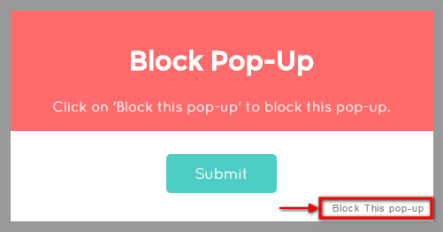
You can change link text, cookie name according to your choice else it will use default value as displayed Here.
Let's say, you want to block modal on click of the link :
$('.className').on('click',function(){
	rplm({
		title: "Block Pop-up",
		text: "Custom Text here.",
		preventDialog: true,
		cookieName: "blockModal",
		preventText: "Block This Pop-up.",
		preventDays: 30,
	});
});
This will set "blockModal" cookie for next "30" days. So you won't be able to open this dialog till 30 days.
Display Pop up only once
Following are the option to set up Modal to display Only once.
$('.className').on('click',function(){
	rplm({
		title: "Block Pop-up",
		text: "Custom Text here.",
		oneTimePopUp: true,
	});
});
Modal Positions
There are 9 positions for replete modal. To use any of them, you need to add the appropriate value to the position attribute. All available positions and options listed in the table below.
| Argument Value |
|---|
| topLeft |
| topCenter |
| topRight |
| leftCenter |
| center |
| rightCenter |
| bottomLeft |
| bottomCenter |
| bottomRight |
Let's say, you want to set modal on Bottom Center :
$('.className').on('click',function(){
	rplm({
		title: "Bottom Center",
		text: "Custom Text here.",
		position:'bottomCenter',
	});
});
Overlay
You have to add overlay argument to set different overlay values. Check overlay options in below table.
| Argument Value | Description |
|---|---|
| white | To set white Overlay with opacity. Just need to write overlay:'white'. |
| black | To set black Overlay with opacity. Just need to write overlay:'black'. |
| transparent | To set transparent Overlay with opacity. Just need to write overlay:'transparent'. |
| blur | To set blur Overlay with opacity. Just need to write overlay:'blur'. You need to wrap your content with "blur-overlay" class to archive the desired blur effect. As shown in the example. |
| custom | To set custom Overlay with opacity. Just need to write overlay:'custom'. |
| customOverlayColor | When you set overlay:'custom' You need to set your color else it will use default. Set HEX color code, to display overlay of that color. |
Let's say, you want to set modal overlay as custom :
$('.className').on('click',function(){
	rplm({
		title: "Overlay Demo",
		text: "Custom Text here.",
		overlay: 'custom',
		customOverlayColor: '#FFA7EC',
	});
});
If you set overlay as custom then only customOverlayColor attribute will work.
Modal Styles
There are some modal styles that will make the modal very attractive and you can find all the options and description in table below. Just set this option values for 'modalNOverlay' argument.
| Option Value | Description |
|---|---|
| black | This option will set black Modal and white Overlay. |
| white | This option will set white modal and black overlay |
| transparent | This option will set transparent background with white overlay |
| roundBorder | To set rounded border to the modal. |
| backShadow | To set back shadow to the modal. |
| custom | To set custom back color to the modal. |
Let's say, you want to set modal with custom color:
$('.className').on('click',function(){
	rplm({
		title: "Overlay Demo",
		text: "Custom Text here.",
		modalNOverlay: 'custom',
		customModalColor: '#FFA7EC',
	});
});
If you set modalNOverlay as custom then only customModalcolor attribute will work.
Animations
There are 40+ different Modal Animations. To use any of them,use animation attribute and add appropriate animation value to attribute. All available Effects and details listed below :
| Attribute Value |
|---|
| bounce |
| flash |
| pulse |
| rubberBand |
| shake |
| swing |
| tada |
| wobble |
| jello |
| bounceIn |
| bounceInDown |
| bounceInLeft |
| bounceInRight |
| bounceInUp |
| fadeIn |
| fadeInDown |
| fadeInDownBig |
| fadeInLeft |
| fadeInLeftBig |
| fadeInRight |
| fadeInRightBig |
| fadeInUp |
| fadeInUpBig |
| flipInX |
| flipInY |
| lightSpeedIn |
| rotateIn |
| rotateInDownLeft |
| rotateInDownRight |
| rotateInUpLeft |
| rotateInUpRight |
| slideInUp |
| slideInDown |
| slideInLeft |
| slideInRight |
| zoomIn |
| zoomInDown |
| zoomInLeft |
| zoomInRight |
| zoomInUp |
| rollIn |
Below is the example showing how to use animation effects. Let's say, If want to set jello animation to the modal.
$('.className').on('click',function(){
	rplm({
		title: "Jello Effect",
		text: 'This is an example of jello effect modal.',
		showCancelButton: true,
		animation: 'jello',
	});
});
Google Map
To implement Google map, you need to set type="map", latitude, longitude and zoom level.
$('.className').on('click',function(){
	rplm({
		title: "Google Map",
			text: '<div id="map" style="width:100%;height:400px;"></div>',
			type: 'map',
			lat: 23.0060,
			lng: 72.6011,
			zoom: 10,
			html: true,
	});
});
You need to set text='<div id="map" style="width:100%;height:400px;"></div>'. You can change height accordingly.
If you set type='map' then set lat(latitude), lng(longitude) and zoom level.
YouTube
To add YouTube Video, you need to use some parameters like youtubeID, videoHeight and videoWidth. Check example given below :
$('.className').on('click',function(){
	rplm({
		title: "YouTube Video",
			youtubeID: "YOUTUBE_VIDEO_ID",
		videoHeight: "YOUTUBE_VIDEO_HEIGHT",
		videoWidth: "YOUTUBE_VIDEO_WIDTH",
		html: true,
	});
});
No need to create text attribute as that will be created automatically using YouTubeID,Height and Width.
Vimeo
To add YouTube Video, you need to use some parameters like vimeoID, videoHeight and videoWidth. Check example given below :
$('.className').on('click',function(){
	rplm({
		title: "Vimeo Video",
			vimeoID: "VIMEO_VIDEO_ID",
		videoHeight: "VIMEO_VIDEO_HEIGHT",
		videoWidth: "VIMEO_VIDEO_WIDTH",
		html: true,
	});
});
No need to create text attribute as that will be created automatically using VimeoID,Height and Width.
Check youtube and vimeo examples for better idea.
SVG Icons
There are 35+ SVG icons in Replete Modal. To use this icon, just need to set svgIcon attribute and need to add svg Icon name that is displayed in below table.
| SVG Icon Name |
|---|
| browser |
| brush |
| calender |
| camera |
| clock |
| coffee |
| diamond |
| disk |
| graph |
| heart |
| home |
| lightning |
| location |
| lock |
| magnify |
| message |
| mic |
| paper |
| pencil |
| phone |
| picture |
| plane |
| present |
| robot |
| rocket |
| screen |
| settings |
| spaceship |
| storm |
| suitcase |
| tag |
| trash |
| thumbsup |
| thumbsdown |
| user |
| winner |
Below is the example showing how to use SVG icon. Let's say, If want to set rocket icon to the modal.
$('.className').on('click',function(){
	rplm({
		title: "SVG Icon",
		text: 'SVG Demo content.',
		svgIcon: 'rocket',
	});
});
Delay
delay is an option that will make the modal to delay in open.
$('.className').on('click',function(){
	rplm({
		title: "Delay Demo",
		text: 'Delay Demo content.',
		delay: 1,
	});
});
This will delay modal open to 1 seconds.
Duration
duration is an option to open the modal slowly.
$('.className').on('click',function(){
	rplm({
		title: "Duration Demo",
		text: 'Duration Demo content.',
		duration: 2,
	});
});
This will open modal slowly in 2 seconds.