# Layout Overrides
# Overview
The src/layouts folder in the root of the src folder is for users to override layouts built in the src/@core folder. It is highly recommended to override layouts in the src/layouts folder instead of directly working in the src/@core folder. This will ease your updates to newer versions without facing any hassle of backing up your current code, else it will override your changes in the src/@core folder each time you take an update.
Most of the layout components explained on this page are overridden in the src/layouts/UserLayout.tsx file.
# Layout PropTypes
Following is the PropTypes for Vertical and Horizontal Layouts only.
export type LayoutProps = {
  hidden: boolean
  settings: Settings
  children: ReactNode
  scrollToTop?: (props?: any) => ReactNode
  saveSettings: (values: Settings) => void
  footerProps?: {
    sx?: SxProps<Theme>
    content?: (props?: any) => ReactNode
  }
  horizontalLayoutProps?: {
    appBar?: {
      componentProps?: AppBarProps
      content?: (props?: any) => ReactNode
      branding?: (props?: any) => ReactNode
    }
    navMenu?: {
      sx?: SxProps<Theme>
      navItems?: HorizontalNavItemsType
      content?: (props?: any) => ReactNode
    }
  }
  verticalLayoutProps: {
    appBar?: {
      componentProps?: AppBarProps
      content?: (props?: any) => ReactNode
    }
    navMenu: {
      lockedIcon?: ReactNode
      unlockedIcon?: ReactNode
      navItems?: VerticalNavItemsType
      content?: (props?: any) => ReactNode
      branding?: (props?: any) => ReactNode
      afterContent?: (props?: any) => ReactNode
      beforeContent?: (props?: any) => ReactNode
      componentProps?: Omit<SwipeableDrawerProps, 'open' | 'onOpen' | 'onClose'>
    }
  }
}
# Vertical Layout
You can override the following layout components:
- App Logo
- Menu collapse icons
- Menu content
- Add content before menu items
- Add content after menu items
- Hide menu based on screen size
- Navbar (or AppBar) Content
- Footer content
- How to add custom styles
# 1. App Logo
If you want to change the app logo, you need to use the verticalLayoutProps prop with the Layout component and the type accepted by this prop is:
verticalLayoutProps: {
  navMenu: {
    branding?: (props?: any) => ReactNode
  }
}
Here is the code to change the app logo:
import { ReactNode } from 'react'
import Box from '@mui/material/Box'
import Typography from '@mui/material/Typography'
import Layout from 'src/@core/layouts/Layout'

interface Props {
  children: ReactNode
}

const AppBrand = () => {
  return (
    <Box sx={{ display: 'flex', alignItems: 'center' }}>
      <img src='...' alt='logo' width='30' height='30' />
      <Typography variant='h6' sx={{ ml: 2 }}>
        React
      </Typography>
    </Box>
  )
}

const UserLayout = ({ children }: Props) => {
  return (
    <Layout
      {...} // other props
      verticalLayoutProps={{
        navMenu: {
          branding: () => <AppBrand />
        }
      }}
    >
      {children}
    </Layout>
  )
}

export default UserLayout
import Box from '@mui/material/Box'
import Typography from '@mui/material/Typography'
import Layout from 'src/@core/layouts/Layout'

const AppBrand = () => {
  return (
    <Box sx={{ display: 'flex', alignItems: 'center' }}>
      <img src='...' alt='logo' width='30' height='30' />
      <Typography variant='h6' sx={{ ml: 2 }}>
        React
      </Typography>
    </Box>
  )
}

const UserLayout = ({ children }) => {
  return (
    <Layout
      {...} // other props
      verticalLayoutProps={{
        navMenu: {
          branding: () => <AppBrand />
        }
      }}
    >
      {children}
    </Layout>
  )
}

export default UserLayout
Result:
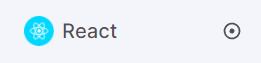
NOTE
When you override the app logo and when the menu is collapsed, padding-left of the menu header will reduce to 0. To center align your logo, you need to manually add margin-left to your overridden logo.
# 2. Menu collapse icons
If you want to change the icons for collapsing the vertical menu, you need to use the verticalLayoutProps prop with the Layout component and the type accepted by this prop is:
verticalLayoutProps: {
  navMenu: {
    lockedIcon?: ReactNode
    unlockedIcon?: ReactNode
  }
}
Here is the code to change the icons for collapsing the vertical menu:
import { ReactNode } from 'react'
import Icon from 'src/@core/components/icon'
import Layout from 'src/@core/layouts/Layout'

interface Props {
  children: ReactNode
}

const UserLayout = ({ children }: Props) => {
  return (
    <Layout
      {...} // other props
      verticalLayoutProps={{
        navMenu: {
          lockedIcon: <Icon icon='mdi:arrow-left-bold-circle-outline' />
          unlockedIcon: <Icon icon='mdi:arrow-right-bold-circle-outline' />
        }
      }}
    >
      {children}
    </Layout>
  )
}

export default UserLayout
import Icon from 'src/@core/components/icon'
import Layout from 'src/@core/layouts/Layout'

const UserLayout = ({ children }) => {
  return (
    <Layout
      {...} // other props
      verticalLayoutProps={{
        navMenu: {
          lockedIcon: <Icon icon='mdi:arrow-left-bold-circle-outline' />
          unlockedIcon: <Icon icon='mdi:arrow-right-bold-circle-outline' />
        }
      }}
    >
      {children}
    </Layout>
  )
}

export default UserLayout
Result of lockedIcon:
Result of unlockedIcon:
# 3. Menu content
If you want to change the menu content, you need to use the verticalLayoutProps prop with the Layout component and the type accepted by this prop is:
verticalLayoutProps: {
  navMenu: {
    content?: (props?: any) => ReactNode
  }
}
Here is the code to change the menu content:
import { ReactNode } from 'react'
import Layout from 'src/@core/layouts/Layout'

interface Props {
  children: ReactNode
}

const Menu = () => {
  return (
    <ul>
      <li>Menu Item 1</li>
      <li>Menu Item 2</li>
      <li>Menu Item 3</li>
      <li>Menu Item 4</li>
      <li>Menu Item 5</li>
    </ul>
  )
}

const UserLayout = ({ children }: Props) => {
  return (
    <Layout
      {...} // other props
      verticalLayoutProps={{
        navMenu: {
          content: () => <Menu />
        }
      }}
    >
      {children}
    </Layout>
  )
}

export default UserLayout
import Layout from 'src/@core/layouts/Layout'

const Menu = () => {
  return (
    <ul>
      <li>Menu Item 1</li>
      <li>Menu Item 2</li>
      <li>Menu Item 3</li>
      <li>Menu Item 4</li>
      <li>Menu Item 5</li>
    </ul>
  )
}

const UserLayout = ({ children }) => {
  return (
    <Layout
      {...} // other props
      verticalLayoutProps={{
        navMenu: {
          content: () => <Menu />
        }
      }}
    >
      {children}
    </Layout>
  )
}

export default UserLayout
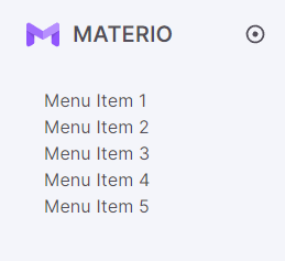
Result:
# 4. Add content before menu items
If you want to add something before the menu items, you need to use the verticalLayoutProps prop with the Layout component and the type accepted by this prop is:
verticalLayoutProps: {
  navMenu: {
    beforeContent?: (props?: any) => ReactNode
  }
}
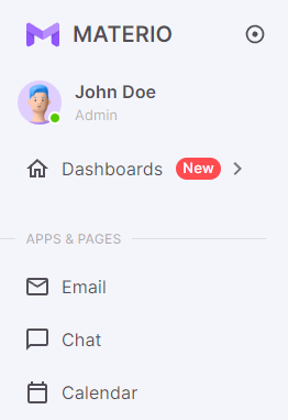
Here is the code to add user info before the menu items:
import { ReactNode } from 'react'
import Box from '@mui/material/Box'
import Badge from '@mui/material/Badge'
import Avatar from '@mui/material/Avatar'
import { styled } from '@mui/material/styles'
import Typography from '@mui/material/Typography'
import Layout from 'src/@core/layouts/Layout'

interface Props {
  children: ReactNode
}

const User = () => {
  const BadgeContentSpan = styled('span')(({ theme }) => ({
    width: 8,
    height: 8,
    borderRadius: '50%',
    backgroundColor: theme.palette.success.main,
    boxShadow: `0 0 0 2px ${theme.palette.background.paper}`
  }))

  return (
    <Box sx={{ py: 2, px: 4, mb: 2.5 }}>
      <Box sx={{ display: 'flex', alignItems: 'center' }}>
        <Badge
          overlap='circular'
          badgeContent={<BadgeContentSpan />}
          anchorOrigin={{
            vertical: 'bottom',
            horizontal: 'right'
          }}
        >
          <Avatar src='...' alt='John Doe' sx={{ width: '2.5rem', height: '2.5rem' }} />
        </Badge>
        <Box sx={{ ml: 3, display: 'flex', alignItems: 'flex-start', flexDirection: 'column' }}>
          <Typography sx={{ fontWeight: 600 }}>John Doe</Typography>
          <Typography variant='body2' sx={{ fontSize: '0.8rem', color: 'text.disabled' }}>
            Admin
          </Typography>
        </Box>
      </Box>
    </Box>
  )
}

const UserLayout = ({ children }: Props) => {
  return (
    <Layout
      {...} // other props
      verticalLayoutProps={{
        navMenu: {
          beforeContent: () => <User />
        }
      }}
    >
      {children}
    </Layout>
  )
}

export default UserLayout
import Box from '@mui/material/Box'
import Badge from '@mui/material/Badge'
import Avatar from '@mui/material/Avatar'
import { styled } from '@mui/material/styles'
import Typography from '@mui/material/Typography'
import Layout from 'src/@core/layouts/Layout'

const User = () => {
  const BadgeContentSpan = styled('span')(({ theme }) => ({
    width: 8,
    height: 8,
    borderRadius: '50%',
    backgroundColor: theme.palette.success.main,
    boxShadow: `0 0 0 2px ${theme.palette.background.paper}`
  }))

  return (
    <Box sx={{ py: 2, px: 4, mb: 2.5 }}>
      <Box sx={{ display: 'flex', alignItems: 'center' }}>
        <Badge
          overlap='circular'
          badgeContent={<BadgeContentSpan />}
          anchorOrigin={{
            vertical: 'bottom',
            horizontal: 'right'
          }}
        >
          <Avatar src='...' alt='John Doe' sx={{ width: '2.5rem', height: '2.5rem' }} />
        </Badge>
        <Box sx={{ ml: 3, display: 'flex', alignItems: 'flex-start', flexDirection: 'column' }}>
          <Typography sx={{ fontWeight: 600 }}>John Doe</Typography>
          <Typography variant='body2' sx={{ fontSize: '0.8rem', color: 'text.disabled' }}>
            Admin
          </Typography>
        </Box>
      </Box>
    </Box>
  )
}

const UserLayout = ({ children }) => {
  return (
    <Layout
      {...} // other props
      verticalLayoutProps={{
        navMenu: {
          beforeContent: () => <User />
        }
      }}
    >
      {children}
    </Layout>
  )
}

export default UserLayout
Result:
# 5. Add content after menu items
If you want to add something after the menu items, you need to use the verticalLayoutProps prop with the Layout component and the type accepted by this prop is:
verticalLayoutProps: {
  navMenu: {
    afterContent?: (props?: any) => ReactNode
  }
}
Here is the code to add menu footer info after the menu items:
import { ReactNode } from 'react'
import Box from '@mui/material/Box'
import Layout from 'src/@core/layouts/Layout'

interface Props {
  children: ReactNode
}

const MenuFooter = () => {
  return (
    <Box
      sx={{
        pt: 4,
        display: 'flex',
        justifyContent: 'center',
        borderTop: theme => `1px solid ${theme.palette.divider}`
      }}
    >
      <img src='...' width='...' height='...' alt='menu-footer' />
    </Box>
  )
}

const UserLayout = ({ children }: Props) => {
  return (
    <Layout
      {...} // other props
      verticalLayoutProps={{
        navMenu: {
          afterContent: () => <MenuFooter />
        }
      }}
    >
      {children}
    </Layout>
  )
}

export default UserLayout
import Box from '@mui/material/Box'
import Layout from 'src/@core/layouts/Layout'

const MenuFooter = () => {
  return (
    <Box
      sx={{
        pt: 4,
        display: 'flex',
        justifyContent: 'center',
        borderTop: theme => `1px solid ${theme.palette.divider}`
      }}
    >
      <img src='...' width='...' height='...' alt='menu-footer' />
    </Box>
  )
}

const UserLayout = ({ children }) => {
  return (
    <Layout
      {...} // other props
      verticalLayoutProps={{
        navMenu: {
          afterContent: () => <MenuFooter />
        }
      }}
    >
      {children}
    </Layout>
  )
}

export default UserLayout
Result:
# 6. Hide menu based on screen size
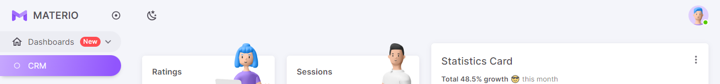
The hidden prop is used to hide the vertical menu at a given screen size. The menu will only be accessible from the Hamburger menu icon which is known as the Vertical Overlay Menu. You can change the screen size from which you want to hide the vertical menu.
In the example below, the vertical menu is visible above the lg breakpoint and on screen size below the lg breakpoint, it will change to the vertical overlay menu which can be accessed from the Hamburger menu icon.
const hidden = useMediaQuery((theme: Theme) => theme.breakpoints.down('lg'))
You can also change its value using a specific screen size:
const hidden = useMediaQuery('(max-width:1365px)')
# 7. Navbar (or AppBar) Content
The content in the appBar comes from the user side itself and thus, it would be very easy and convenient for you to change anything in the appBar. You just have to change the code in the src/layouts/components/vertical/AppBarContent.tsx file as per your requirements. The appBar component is then passed in the verticalLayoutProps prop with the Layout component and the type accepted by this prop is:
verticalLayoutProps: {
  appBar?: {
    content?: (props?: any) => ReactNode
  }
}
Here is the code to change the appBar:
// src/layouts/components/vertical/AppBarContent.tsx

import Box from '@mui/material/Box'
import IconButton from '@mui/material/IconButton'
import { Settings } from 'src/@core/context/settingsContext'
import Icon from 'src/@core/components/icon'
import ModeToggler from 'src/@core/layouts/components/shared-components/ModeToggler'
import UserDropdown from 'src/@core/layouts/components/shared-components/UserDropdown'

interface Props {
  hidden: boolean
  settings: Settings
  toggleNavVisibility: () => void
  saveSettings: (values: Settings) => void
}

const AppBarContent = (props: Props) => {
  const { hidden, settings, saveSettings, toggleNavVisibility } = props

  return (
    <Box sx={{ width: '100%', display: 'flex', alignItems: 'center', justifyContent: 'space-between' }}>
      <Box className='actions-left' sx={{ mr: 2, display: 'flex', alignItems: 'center' }}>
        {hidden ? (
          <IconButton color='inherit' sx={{ ml: -2.75 }} onClick={toggleNavVisibility}>
            <Icon icon='mdi:menu' />
          </IconButton>
        ) : null}
        <ModeToggler settings={settings} saveSettings={saveSettings} />
      </Box>
      <UserDropdown settings={settings} />
    </Box>
  )
}

export default AppBarContent
// src/layouts/components/vertical/AppBarContent.js

import Box from '@mui/material/Box'
import IconButton from '@mui/material/IconButton'
import Icon from 'src/@core/components/icon'
import ModeToggler from 'src/@core/layouts/components/shared-components/ModeToggler'
import UserDropdown from 'src/@core/layouts/components/shared-components/UserDropdown'

const AppBarContent = props => {
  const { hidden, settings, saveSettings, toggleNavVisibility } = props

  return (
    <Box sx={{ width: '100%', display: 'flex', alignItems: 'center', justifyContent: 'space-between' }}>
      <Box className='actions-left' sx={{ mr: 2, display: 'flex', alignItems: 'center' }}>
        {hidden ? (
          <IconButton color='inherit' sx={{ ml: -2.75 }} onClick={toggleNavVisibility}>
            <Icon icon='mdi:menu' />
          </IconButton>
        ) : null}
        <ModeToggler settings={settings} saveSettings={saveSettings} />
      </Box>
      <UserDropdown settings={settings} />
    </Box>
  )
}

export default AppBarContent
// src/layouts/UserLayout.tsx

import { ReactNode } from 'react'
import { Theme } from '@mui/material/styles'
import useMediaQuery from '@mui/material/useMediaQuery'
import Layout from 'src/@core/layouts/Layout'
import { useSettings } from 'src/@core/hooks/useSettings'
import VerticalAppBarContent from 'src/layouts/components/vertical/AppBarContent'

interface Props {
  children: ReactNode
}

const UserLayout = ({ children }: Props) => {
  const { settings, saveSettings } = useSettings()
  const hidden = useMediaQuery((theme: Theme) => theme.breakpoints.down('lg'))

  return (
    <Layout
      {...} // other props
      verticalLayoutProps={{
        appBar: {
          content: props => (
            <VerticalAppBarContent
              hidden={hidden}
              settings={settings}
              saveSettings={saveSettings}
              toggleNavVisibility={props.toggleNavVisibility}
            />
          )
        }
      }}
    >
      {children}
    </Layout>
  )
}

export default UserLayout
// src/layouts/UserLayout.js

import useMediaQuery from '@mui/material/useMediaQuery'
import Layout from 'src/@core/layouts/Layout'
import { useSettings } from 'src/@core/hooks/useSettings'
import VerticalAppBarContent from 'src/layouts/components/vertical/AppBarContent'

const UserLayout = ({ children }) => {
  const { settings, saveSettings } = useSettings()
  const hidden = useMediaQuery(theme => theme.breakpoints.down('lg'))

  return (
    <Layout
      {...} // other props
      verticalLayoutProps={{
        appBar: {
          content: props => (
            <VerticalAppBarContent
              hidden={hidden}
              settings={settings}
              saveSettings={saveSettings}
              toggleNavVisibility={props.toggleNavVisibility}
            />
          )
        }
      }}
    >
      {children}
    </Layout>
  )
}

export default UserLayout
Result:
# 8. Footer content
If you want to change the footer content, you need to use the footerProps prop with the Layout component and the type accepted by this prop is:
footerProps?: {
  content?: (props?: any) => ReactNode
}
Here is the code to change the footer content:
import { ReactNode } from 'react'
import Layout from 'src/@core/layouts/Layout'

interface Props {
  children: ReactNode
}

const UserLayout = ({ children }: Props) => {
  return (
    <Layout
      {...} // other props
      footerProps={{
        content: () => 'I am footer which is overridden by the user'
      }}
    >
      {children}
    </Layout>
  )
}

export default UserLayout
import Layout from 'src/@core/layouts/Layout'

const UserLayout = ({ children }) => {
  return (
    <Layout
      {...} // other props
      footerProps={{
        content: () => 'I am footer which is overridden by the user'
      }}
    >
      {children}
    </Layout>
  )
}

export default UserLayout
Result:

# 9. How to add custom styles
You can add your custom styles for the whole layout with the help of footerProps and verticalLayoutProps props with the Layout component. The type for the same is:
footerProps?: {
  sx?: SxProps<Theme>
}
verticalLayoutProps: {
  appBar?: {
    componentProps?: AppBarProps
  }
  navMenu: {
    componentProps?: Omit<SwipeableDrawerProps, 'open' | 'onOpen' | 'onClose'>
  }
}
Refer to the following example for adding your custom styles:
import { ReactNode } from 'react'
import Layout from 'src/@core/layouts/Layout'

interface Props {
  children: ReactNode
}

const UserLayout = ({ children }: Props) => {
  return (
    <Layout
      {...} // other props
      footerProps={{
        sx: { p: 5, backgroundColor: theme => theme.palette.background.paper }
      }},
      verticalLayoutProps={{
        navMenu: {
          componentProps: {
            sx: { '& .nav-header': { borderBottom: theme => `1px solid ${theme.palette.divider}` } }
          },
          appBar: {
            componentProps: {
              sx: { boxShadow: theme => theme.shadows[9] }
            }
          }
        }
      }}
    >
      {children}
    </Layout>
  )
}

export default UserLayout
import Layout from 'src/@core/layouts/Layout'

const UserLayout = ({ children }) => {
  return (
    <Layout
      {...} // other props
      footerProps={{
        sx: { p: 5, backgroundColor: theme => theme.palette.background.paper }
      }},
      verticalLayoutProps={{
        navMenu: {
          componentProps: {
            sx: { '& .nav-header': { borderBottom: theme => `1px solid ${theme.palette.divider}` } }
          },
          appBar: {
            componentProps: {
              sx: { boxShadow: theme => theme.shadows[9] }
            }
          }
        }
      }}
    >
      {children}
    </Layout>
  )
}

export default UserLayout
# Horizontal Layout
Important!
As mentioned here, you need to add all the necessary items for the Vertical Layout. Please follow these steps to add items for the Vertical Layout and then follow the steps explained below.
You can override the following layout components:
- App Logo
- Menu content
- Hide menu based on screen size
- AppBar Content
- Footer content
- How to add custom styles
# 1. App Logo
If you want to change the app logo, you need to use the verticalLayoutProps and horizontalLayoutProps props with the Layout component and the type accepted by these props is:
verticalLayoutProps: {
  navMenu: {
    branding?: (props?: any) => ReactNode
  }
}
horizontalLayoutProps?: {
  appBar?: {
    branding?: (props?: any) => ReactNode
  }
}
Here is the code to change the app logo:
import { ReactNode } from 'react'
import Box from '@mui/material/Box'
import Typography from '@mui/material/Typography'
import Layout from 'src/@core/layouts/Layout'

interface Props {
  children: ReactNode
}

const AppBrand = () => {
  return (
    <Box sx={{ display: 'flex', alignItems: 'center' }}>
      <img src='...' alt='logo' width='30' height='30' />
      <Typography variant='h6' sx={{ ml: 2 }}>
        React
      </Typography>
    </Box>
  )
}

const UserLayout = ({ children }: Props) => {
  return (
    <Layout
      {...} // other props
      verticalLayoutProps={{
        navMenu: {
          branding: () => <AppBrand />
        }
      }}
      {...(settings.layout === 'horizontal' && {
        horizontalLayoutProps: {
          appBar: {
            branding: () => <AppBrand />
          }
        }
      })}
    >
      {children}
    </Layout>
  )
}

export default UserLayout
import Box from '@mui/material/Box'
import Typography from '@mui/material/Typography'
import Layout from 'src/@core/layouts/Layout'

const AppBrand = () => {
  return (
    <Box sx={{ display: 'flex', alignItems: 'center' }}>
      <img src='...' alt='logo' width='30' height='30' />
      <Typography variant='h6' sx={{ ml: 2 }}>
        React
      </Typography>
    </Box>
  )
}

const UserLayout = ({ children }) => {
  return (
    <Layout
      {...} // other props
      verticalLayoutProps={{
        navMenu: {
          branding: () => <AppBrand />
        }
      }}
      {...(settings.layout === 'horizontal' && {
        horizontalLayoutProps: {
          appBar: {
            branding: () => <AppBrand />
          }
        }
      })}
    >
      {children}
    </Layout>
  )
}

export default UserLayout
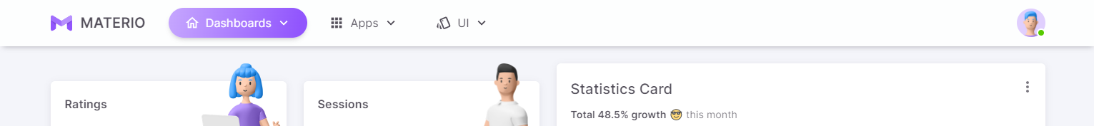
Result:
# 2. Menu content
If you want to change the menu content, you need to use the verticalLayoutProps and horizontalLayoutProps props with the Layout component and the type accepted by these props is:
verticalLayoutProps: {
  navMenu: {
    content?: (props?: any) => ReactNode
  }
}
horizontalLayoutProps?: {
  navMenu: {
    content?: (props?: any) => ReactNode
  }
}
Here is the code to change the menu content:
import { ReactNode } from 'react'
import Layout from 'src/@core/layouts/Layout'
interface Props {
children: ReactNode
}
const Menu = () => {
return (
<ul>
<li>Menu Item 1</li>
<li>Menu Item 2</li>
<li>Menu Item 3</li>
<li>Menu Item 4</li>
<li>Menu Item 5</li>
</ul>
)
}
const UserLayout = ({ children }: Props) => {
return (
<Layout
{...} // other props
verticalLayoutProps={{
navMenu: {
content: () => <Menu />
}
}}
{...(settings.layout === 'horizontal' && {
horizontalLayoutProps: {
navMenu: {
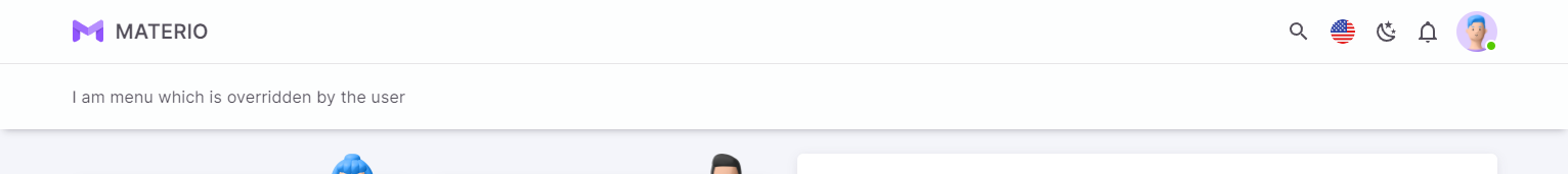
content: () => 'I am menu which is overridden by the user'
}
}
})}
>
{children}
</Layout>
)
}
export default UserLayout
import Layout from 'src/@core/layouts/Layout'

const Menu = () => {
  return (
    <ul>
      <li>Menu Item 1</li>
      <li>Menu Item 2</li>
      <li>Menu Item 3</li>
      <li>Menu Item 4</li>
      <li>Menu Item 5</li>
    </ul>
  )
}

const UserLayout = ({ children }) => {
  return (
    <Layout
      {...} // other props
      verticalLayoutProps={{
        navMenu: {
          content: () => <Menu />
        }
      }}
      {...(settings.layout === 'horizontal' && {
        horizontalLayoutProps: {
          navMenu: {
            content: () => 'I am menu which is overridden by the user'
          }
        }
      })}
    >
      {children}
    </Layout>
  )
}

export default UserLayout
Result:
# 3. Hide menu based on screen size
The hidden prop is used to hide the horizontal menu at a given screen size. The menu will only be accessible from the Hamburger menu icon which is known as the Vertical Overlay Menu. You can change the screen size from which you want to hide the horizontal menu.
In the example below, the horizontal menu is visible above the lg breakpoint and on screen size below the lg breakpoint, it will change to the vertical overlay menu which can be accessed from the Hamburger menu icon.
const hidden = useMediaQuery((theme: Theme) => theme.breakpoints.down('lg'))
You can also change its value using a specific screen size:
const hidden = useMediaQuery('(max-width:1365px)')
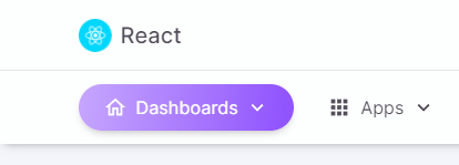
# 4. AppBar Content
The content in the appBar which is on the right side comes from the user side itself and thus, it would be very easy and convenient for you to change anything in the appBar. You just have to change the code in the src/layouts/components/horizontal/AppBarContent.tsx file. The appBar component is then passed in the horizontalLayoutProps prop with the Layout component. The appBar component for the Vertical Layout (which comes from the src/layouts/components/vertical/AppBarContent.tsx file) is passed in the verticalLayoutProps prop with the Layout component.
The type accepted by these props is:
verticalLayoutProps: {
  appBar?: {
    content?: (props?: any) => ReactNode
  }
}
horizontalLayoutProps?: {
  appBar?: {
    content?: (props?: any) => ReactNode
  }
}
Suppose you need the app logo, navigation menu as well as some actions in one line, then you need to follow the steps given below.
Firstly, you need to hide the navigation menu section which is below the appBar from the src/configs/themeConfig.ts file:
// src/configs/themeConfig.ts

const themeConfig: ThemeConfig = {
  ...,
  navHidden: true,
  ...
}
// src/configs/themeConfig.js

const themeConfig = {
  ...,
  navHidden: true,
  ...
}
Then you need to change the appBar accordingly:
// src/layouts/components/horizontal/AppBarContent.tsx

import Box from '@mui/material/Box'
import { Settings } from 'src/@core/context/settingsContext'
import { HorizontalNavItemsType } from 'src/@core/layouts/types'
import Navigation from 'src/@core/layouts/components/horizontal/navigation'
import UserDropdown from 'src/@core/layouts/components/shared-components/UserDropdown'

interface Props {
  settings: Settings
  horizontalNavItems?: HorizontalNavItemsType
}

const AppBarContent = (props: Props) => {
  const { settings, horizontalNavItems } = props

  return (
    <Box sx={{ width: '100%', display: 'flex', alignItems: 'center', justifyContent: 'space-between' }}>
      <Navigation settings={settings} horizontalNavItems={horizontalNavItems} />
      <UserDropdown settings={settings} />
    </Box>
  )
}

export default AppBarContent
// src/layouts/components/horizontal/AppBarContent.js

import Box from '@mui/material/Box'
import Navigation from 'src/@core/layouts/components/horizontal/navigation'
import UserDropdown from 'src/@core/layouts/components/shared-components/UserDropdown'

const AppBarContent = props => {
  const { settings, horizontalNavItems } = props

  return (
    <Box sx={{ width: '100%', display: 'flex', alignItems: 'center', justifyContent: 'space-between' }}>
      <Navigation settings={settings} horizontalNavItems={horizontalNavItems} />
      <UserDropdown settings={settings} />
    </Box>
  )
}

export default AppBarContent
Then you need to pass that component in the horizontalLayoutProps prop with the Layout component:
// src/layouts/UserLayout.tsx

import { ReactNode } from 'react'
import Layout from 'src/@core/layouts/Layout'
import { useSettings } from 'src/@core/hooks/useSettings'
import HorizontalNavItems from 'src/navigation/horizontal'
import VerticalAppBarContent from './components/vertical/AppBarContent'
import HorizontalAppBarContent from './components/horizontal/AppBarContent'

interface Props {
  children: ReactNode
}

const UserLayout = ({ children }: Props) => {
  const { settings } = useSettings()
  return (
    <Layout
      {...} // other props
      verticalLayoutProps={{
        appBar: {
          content: props => (
            <VerticalAppBarContent
              hidden={hidden}
              settings={settings}
              saveSettings={saveSettings}
              toggleNavVisibility={props.toggleNavVisibility}
            />
          )
        }
      }}
      {...(settings.layout === 'horizontal' && {
        horizontalLayoutProps: {
          appBar: {
            content: () => (
              <HorizontalAppBarContent settings={settings} horizontalNavItems={HorizontalNavItems()} />
            )
          }
        }
      })}
    >
      {children}
    </Layout>
  )
}

export default UserLayout
// src/layouts/UserLayout.js

import Layout from 'src/@core/layouts/Layout'
import { useSettings } from 'src/@core/hooks/useSettings'
import HorizontalNavItems from 'src/navigation/horizontal'
import VerticalAppBarContent from './components/vertical/AppBarContent'
import HorizontalAppBarContent from './components/horizontal/AppBarContent'

const UserLayout = ({ children }) => {
  const { settings } = useSettings()
  return (
    <Layout
      {...} // other props
      verticalLayoutProps={{
        appBar: {
          content: props => (
            <VerticalAppBarContent
              hidden={hidden}
              settings={settings}
              saveSettings={saveSettings}
              toggleNavVisibility={props.toggleNavVisibility}
            />
          )
        }
      }}
      {...(settings.layout === 'horizontal' && {
        horizontalLayoutProps: {
          appBar: {
            content: () => (
              <HorizontalAppBarContent settings={settings} horizontalNavItems={HorizontalNavItems()} />
            )
          }
        }
      })}
    >
      {children}
    </Layout>
  )
}

export default UserLayout
Result:
# 5. Footer content
If you want to change the footer content, you need to use the footerProps prop with the Layout component and the type accepted by this prop is:
footerProps?: {
  content?: (props?: any) => ReactNode
}
Here is the code to change the footer content:
import { ReactNode } from 'react'
import Layout from 'src/@core/layouts/Layout'

interface Props {
  children: ReactNode
}

const UserLayout = ({ children }: Props) => {
  return (
    <Layout
      {...} // other props
      footerProps={{
        content: () => 'I am footer which is overridden by the user'
      }}
    >
      {children}
    </Layout>
  )
}

export default UserLayout
import Layout from 'src/@core/layouts/Layout'

const UserLayout = ({ children }) => {
  return (
    <Layout
      {...} // other props
      footerProps={{
        content: () => 'I am footer which is overridden by the user'
      }}
    >
      {children}
    </Layout>
  )
}

export default UserLayout
Result:

# 6. How to add custom styles
You can add your custom styles for the whole layout with the help of footerProps, verticalLayoutProps and horizontalLayoutProps props with the Layout component. The type for the same is:
footerProps?: {
  sx?: SxProps<Theme>
}
verticalLayoutProps: {
  appBar?: {
    componentProps?: AppBarProps
  }
  navMenu: {
    componentProps?: Omit<SwipeableDrawerProps, 'open' | 'onOpen' | 'onClose'>
  }
}
horizontalLayoutProps?: {
  appBar?: {
    componentProps?: AppBarProps
  }
  navMenu?: {
    sx?: SxProps<Theme>
  }
}
Refer to the following example for adding your custom styles:
import { ReactNode } from 'react'
import Layout from 'src/@core/layouts/Layout'

interface Props {
  children: ReactNode
}

const UserLayout = ({ children }: Props) => {
  return (
    <Layout
      {...} // other props
      footerProps={{
        sx: { p: 5, backgroundColor: theme => theme.palette.background.paper }
      }},
      verticalLayoutProps={{
        navMenu: {
          componentProps: {
            sx: { '& .nav-header': { borderBottom: theme => `1px solid ${theme.palette.divider}` } }
          },
          appBar: {
            componentProps: {
              sx: { boxShadow: theme => theme.shadows[9] }
            }
          }
        }
      }}
      {...(settings.layout === 'horizontal' && {
        horizontalLayoutProps: {
          appBar: {
            componentProps: {
              sx: { boxShadow: theme => theme.shadows[9] }
            }
          },
          navMenu: {
            sx: {
              '& .menu-content > *:not(:last-child)': {
                pr: 2,
                borderRight: theme => `1px solid ${theme.palette.divider}`
              }
            }
        }
      })}
    >
      {children}
    </Layout>
  )
}

export default UserLayout
import Layout from 'src/@core/layouts/Layout'

const UserLayout = ({ children }) => {
  return (
    <Layout
      {...} // other props
      footerProps={{
        sx: { p: 5, backgroundColor: theme => theme.palette.background.paper }
      }},
      verticalLayoutProps={{
        navMenu: {
          componentProps: {
            sx: { '& .nav-header': { borderBottom: theme => `1px solid ${theme.palette.divider}` } }
          },
          appBar: {
            componentProps: {
              sx: { boxShadow: theme => theme.shadows[9] }
            }
          }
        }
      }}
      {...(settings.layout === 'horizontal' && {
        horizontalLayoutProps: {
          appBar: {
            componentProps: {
              sx: { boxShadow: theme => theme.shadows[9] }
            }
          },
          navMenu: {
            sx: {
              '& .menu-content > *:not(:last-child)': {
                pr: 2,
                borderRight: theme => `1px solid ${theme.palette.divider}`
              }
            }
        }
      })}
    >
      {children}
    </Layout>
  )
}

export default UserLayout
# Blank Layout
If you want to change the Blank Layout, you need to follow these steps:
- Make a new file (let us say
UserBlankLayout.tsxfile name) in thesrc/layoutsfolder - Copy the whole code from the
src/@core/layouts/BlankLayout.tsxfile and paste it into thesrc/layouts/UserBlankLayout.tsxfile - Edit the
src/layouts/UserBlankLayout.tsxfile as per your requirements - Now, to use this layout in any of your pages, you need to do this:
import { ReactNode } from 'react'
import UserBlankLayout from 'src/layouts/UserBlankLayout'

const Component = () => {
  return (
    // Your content
  )
}

Component.getLayout = (page: ReactNode) => <UserBlankLayout>{page}</UserBlankLayout>

export default Component
import UserBlankLayout from 'src/layouts/UserBlankLayout'

const Component = () => {
  return (
    // Your content
  )
}

Component.getLayout = page => <UserBlankLayout>{page}</UserBlankLayout>

export default Component
# Blank Layout with AppBar
If you want to change the navbar, you need to follow these steps:
- Make a new file (let us say
UserBlankLayoutWithAppBar.tsxfile name) in thesrc/layoutsfolder - Copy the whole code from the
src/@core/layouts/BlankLayoutWithAppBar.tsxfile and paste it into thesrc/layouts/UserBlankLayoutWithAppBar.tsxfile - Edit the
src/layouts/UserBlankLayoutWithAppBar.tsxfile as per your requirements - Now, to use this layout in any of your pages, you need to do this:
import { ReactNode } from 'react'
import UserBlankLayoutWithAppBar from 'src/layouts/UserBlankLayoutWithAppBar'

const Component = () => {
  return (
    // Your content
  )
}

Component.getLayout = (page: ReactNode) => <UserBlankLayoutWithAppBar>{page}</UserBlankLayoutWithAppBar>

export default Component
import UserBlankLayoutWithAppBar from 'src/layouts/UserBlankLayoutWithAppBar'

const Component = () => {
  return (
    // Your content
  )
}

Component.getLayout = page => <UserBlankLayoutWithAppBar>{page}</UserBlankLayoutWithAppBar>

export default Component
# Scroll to Top
If you want to change the scroll to top component, you need to use the scrollToTop prop with the Layout component in the src/layouts/UserLayout.tsx file and the type accepted by this prop is:
scrollToTop?: (props?: any) => ReactNode
Here is the code to change the scroll to top component:
import { ReactNode } from 'react'
import Button from '@mui/material/Button'
import Layout from 'src/@core/layouts/Layout'
import ScrollToTop from 'src/@core/components/scroll-to-top'

interface Props {
  children: ReactNode
}

const UserScrollToTop = () => {
  return (
    <ScrollToTop>
      <Button color='success' variant='contained'>
        Scroll To Top
      </Button>
    </ScrollToTop>
  )
}

const UserLayout = ({ children }: Props) => {
  return (
    <Layout
      {...} // other props
      scrollToTop={() => <UserScrollToTop />}
    >
      {children}
    </Layout>
  )
}

export default UserLayout
import Button from '@mui/material/Button'
import Layout from 'src/@core/layouts/Layout'
import ScrollToTop from 'src/@core/components/scroll-to-top'

const UserScrollToTop = () => {
  return (
    <ScrollToTop>
      <Button color='success' variant='contained'>
        Scroll To Top
      </Button>
    </ScrollToTop>
  )
}

const UserLayout = ({ children } => {
  return (
    <Layout
      {...} // other props
      scrollToTop={() => <UserScrollToTop />}
    >
      {children}
    </Layout>
  )
}

export default UserLayout
Result:
# Customizer
If you want to override the customizer or make a custom customizer, then follow these steps:
- Hide the customizer from the
src/configs/themeConfig.tsfile
// src/configs/themeConfig.ts

const themeConfig: ThemeConfig = {
  ...,
  disableCustomizer: true,
  ...
}
// src/configs/themeConfig.js

const themeConfig = {
  ...,
  disableCustomizer: true,
  ...
}
- Make a new file (let us say
Customizer.tsxfile name) in thesrc/layouts/componentsfolder - Copy the whole code from the
src/@core/components/customizer/index.tsxfile and paste it into thesrc/layouts/components/Customizer.tsxfile - Edit the
src/layouts/components/Customizer.tsxfile as per your requirements - Render this customizer in the
src/layouts/UserLayout.tsxfile:
// src/layouts/UserLayout.tsx

import { ReactNode } from 'react'
import Layout from 'src/@core/layouts/Layout'
import Customizer from 'src/layouts/components/Customizer'

interface Props {
  children: ReactNode
}

const UserLayout = ({ children }: Props) => {
  return (
    <Layout
      {...} // all the props
    >
      {children}
      <Customizer />
    </Layout>
  )
}

export default UserLayout
// src/layouts/UserLayout.js

import Layout from 'src/@core/layouts/Layout'
import Customizer from 'src/layouts/components/Customizer'

const UserLayout = ({ children }) => {
  return (
    <Layout
      {...} // all the props
    >
      {children}
      <Customizer />
    </Layout>
  )
}

export default UserLayout