# Badge
# Overview
Please visit MUI Badge Docs (opens new window) for a proper explanation of the Badge component.
Badge component is slightly modified to make it more beautiful and useable. Let's have a glance.
Note
We have only mentioned the extended props here but you can still use the default MUI badge props.
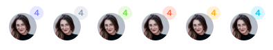
# Badge Skins
There is only one badge skin light.
Here is an example of how to use the skin:
import Avatar from '@mui/material/Avatar'
import CustomBadge from 'src/@core/components/mui/badge'

<CustomBadge skin='light' color='primary' badgeContent={4}>
  <Avatar src='/images/avatars/3.png' alt='User Avatar' />
</CustomBadge>
<CustomBadge skin='light' color='secondary' badgeContent={4}>
  <Avatar src='/images/avatars/3.png' alt='User Avatar' />
</CustomBadge>
<CustomBadge skin='light' color='success' badgeContent={4}>
  <Avatar src='/images/avatars/3.png' alt='User Avatar' />
</CustomBadge>
<CustomBadge skin='light' color='error' badgeContent={4}>
  <Avatar src='/images/avatars/3.png' alt='User Avatar' />
</CustomBadge>
<CustomBadge skin='light' color='warning' badgeContent={4}>
  <Avatar src='/images/avatars/3.png' alt='User Avatar' />
</CustomBadge>
<CustomBadge skin='light' color='info' badgeContent={4}>
  <Avatar src='/images/avatars/3.png' alt='User Avatar' />
</CustomBadge>
Result:
# Props
| Prop | Type | Required | Description |
|---|---|---|---|
| skin | light | No | Skin of the Badge |