MUI Avatars - Example & Tutorial
Please refer to MUI's official docs for more details on component's usage guide and API documentation.
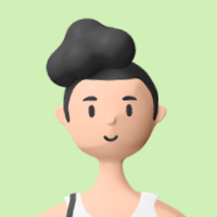
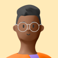
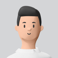
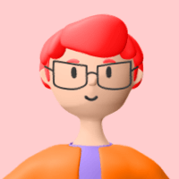
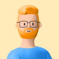
Use src and alt props with Avatar component for basic image avatar.
Write some letters inside Avatar component to have letter avatar. Use our custom component for colored avatar and use skin='light' prop for light variant with opacity and skin='light-static' prop for light variant without opacity.
You can set any size of an avatar using styled hook.
Pass an icon as a child of Avatar component to make an icon avatar.
Use variant={'square' | 'rounded'} prop with Avatar component for different variants.
Use Avatar component as a child of Badge component.
Use class pull-up with AvatarGroup component for pull-up effect on hover of the avatar.
Use class pull-up with AvatarGroup component and wrap your Avatar with Tooltip for pull-up effect & tooltip on hover of the avatar.
Wrap all your avatars with AvatarGroup component to have grouped avatars. Use max prop with AvatarGroup component to restrict maximum number of avatars shown.