Appearance
Customize navbar
In this guide we will look at how you can customize the navbar in both layout components (VerticalNavLayout and HorizontalNavLayout) provided by layouts plugin.
Both components provide navbar scoped slot that you can use to add custom content to the navbar.
Vertical nav layout
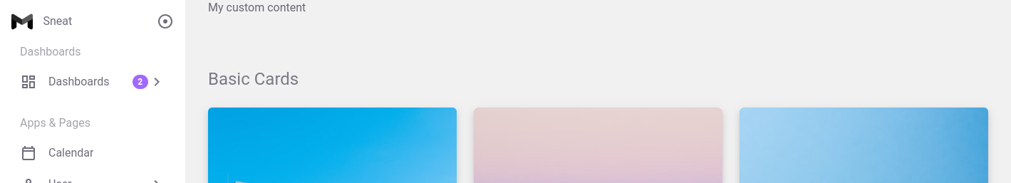
This layout component is used in @/layouts/components/DefaultLayoutWithVerticalNav.vue file. In there, there's already a navbar scoped slot in use, you can customize it according to your needs.
vue
<template>
<VerticalNavLayout :nav-items="navItems">
    <!-- 👉 navbar -->
   <template #navbar="{ toggleVerticalOverlayNavActive }">
      <span>My custom content</span>
    </template>

    <!-- Other content -->
  </VerticalNavLayout>
</template>
Result:
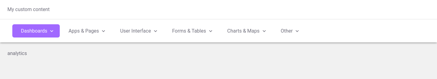
Horizontal nav layout
This layout component is used in @/layouts/components/DefaultLayoutWithHorizontalNav.vue file. In there, there's already a navbar scoped slot in use, you can customize it according to your needs.
vue
<template>
  <HorizontalNavLayout :nav-items="navItems">
    <!-- 👉 navbar -->
    <template #navbar>
      <span>My custom content</span>
    </template>

    <!-- Other content -->
  </HorizontalNavLayout>
</template>
Result:
Using components
You can find navbar specific components in layouts plugin and @core dir. Below is list of components that you can use to customize the navbar.
- I18n (layouts plugin)
- Notifications (layouts plugin)
- ThemeSwitcher (@core)