Appearance
Misc Components
JetShip offers a range of reusable Blade components to help you build and launch your SaaS faster. Below is a list of useful components you can directly integrate into your project.
1. Social Login
A component for social login. This component renders buttons of OAuth social login providers that you have configured in your Login Providers Settings.
blade
<x-auth.social-login></x-auth.social-login>
2. Social Login with Title
Similar to the first component. It displays the login provider's name with its icon.
blade
<x-auth.social-login-with-title></x-auth.social-login-with-title>
3. Social Btn
A component for displaying Social Links that you have configured in General Settings through admin panel. In this component, the :socialNetwork prop is used to pass a social network object, which contains information about the social platform (like URL, icon, etc.). The component dynamically displays the social button based on the socialNetwork data.
blade
<x-btn.social-btn :socialNetwork="$socialNetwork"></x-btn.social-btn>
4. CTA Buy Now
A Call to Action component.
blade
<x-landing-page.cta-buy-now></x-landing-page.cta-buy-now>
5. CTA Discord
A Call to Action component for Discord This component accepts several props to customize the content for the Discord call-to-action:
ctaTitle: The main heading or title of the CTA (e.g., "Join Our Community of Innovators").ctaDescription: A short description explaining why the user should join (e.g., "Connect with other businesses...").ctaButtonText: The text that will appear on the button (e.g., "Join Our Community Now").ctaButtonLink: The URL link that the button will redirect to (e.g., the Discord invite link).
blade
<x-landing-page.cta-discord
  ctaTitle="Join Our Community of Innovators"
  ctaDescription="Connect with other businesses using ChatFlow AI, share best practices, get tips from experts, and collaborate on enhancing customer support experiences."
  ctaButtonText="Join Our Community Now"
  ctaButtonLink="https://discord.com/invite/kBHkY7DekX">
</x-landing-page.cta-discord>
6. Image Toggler
This component is designed to switch the image based on the current theme. You can find the code for this component at resources/views/components/misc/image-toggler.blade.php. Feel free to modify this component to suit the themes you have set up in your project.
Here are the props:
darkImage: Path to the image that will be displayed in dark mode.lightImage: Path to the image that will be displayed in light mode.altText: Alt text for the image for accessibility.class: Any additional CSS classes you want to apply to the image (e.g.,rounded-xlto give rounded corners).
blade
<x-misc.image-toggler
  darkImage="/path-to-dark-image"
  lightImage="/path-to-light-image"
  altText="alt text for image"
  class="rounded-xl">
</x-misc.image-toggler>
7. Theme Switcher
This component does not take any props. It simply renders a button to toggle between light and dark themes.
blade
<x-layouts.components.theme-switcher></x-layouts.components.theme-switcher>8. Custom Loader
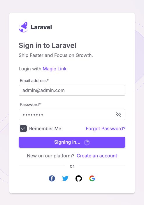
The Custom Loader component is designed to display a loading icon and change the button text while a form is being submitted. This improves the UX by indicating that a process is in progress.
Here’s a code snippet demonstrating how to use the custom-loader component:
blade
<button class="btn btn-primary w-full" type="submit">
  <x-misc.custom-loader
    label="Sign up to"           <!-- The label before loading starts -->
    loadingText="Signing up..."  <!-- The text shown while loading -->
  >
  </x-misc.custom-loader>
</button>
label: This defines the default text before the loading starts (e.g., "Sign up to").loadingText: This changes the button text while the form is being submitted (e.g., "Signing up...").
💡 Tip: Use this component when you want to provide immediate feedback to the user during form submission. It’s especially useful in cases where the submission process might take a few seconds, like registering or logging in.
9. Simple Link
The Simple Link component is used to apply consistent styling to all links across your application.
Here’s a basic code snippet that shows how to use the simple-link component:
blade
<x-link.simple-link href="/pricing">
Pricing  <!-- The link text -->
</x-link.simple-link>href: This defines the destination URL for the link (e.g.,/pricing).
💡 Tip: Use the simple-link component to standardize link styles across your app, ensuring consistency and making your design easier to maintain.
These pre-built components save time and provide a polished look to your UI without requiring additional styling or scripting.