Misc Components
In addition to the core components, JetShip also provides a variety of Miscellaneous Components that can be used throughout your project. These components offer specialized functionality that complements the overall design of your app.
Below is an overview of the available Misc Components and how to integrate them into your project.
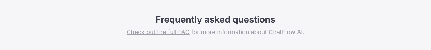
1. Section Header
The Section Header component is used to display a header for any section of your page, typically including a title and an optional subtitle to introduce the content of that section.
⚙️ Props
- title (required): The main title of the section.
- subtitle (optional): An optional subtitle that provides additional context.
- className (optional): Tailwind CSS classes for styling the section header container.
- titleClassName (optional): Tailwind CSS classes for styling the title.
- subtitleClassName (optional): Tailwind CSS classes for styling the subtitle.
👀 Preview and Code
- Preview
- Code
import SectionHeader from '@repo/ui/blocks/others/SectionHeader'

const Component = () => {
  return <SectionHeader title={...} subtitle={...} />
}

export default Component
2. Section Wrapper
The Section Wrapper is used to wrap any section with a container that provides default padding and a maximum width. It’s commonly used to wrap all sections and ensure consistent spacing and layout.
⚙️ Props
- children (required): The content to be wrapped inside the section.
- className (optional): Tailwind CSS classes to apply to the wrapper container.
- id (optional): An optional ID for the section wrapper.
- sectionClassName (optional): Tailwind CSS classes for styling the section itself.
3. Section Separator
The Section Separator is used to display a separator between sections, featuring an eye-catching gradient design that visually divides the sections.
⚙️ Props
- className (optional): Tailwind CSS classes to customize the appearance of the separator.
- transitionDelay (optional): The delay for transitions, useful for controlling the timing of the separator’s appearance.
- transitionDuration (optional): The duration for the transition, ensuring smooth visual effects.
👀 Preview and Code
- Preview
- Code

import SectionSeparator from '@repo/ui/blocks/others/SectionSeparator'

const Component = () => {
  return <SectionSeparator />
}

export default Component
4. Custom Inputs
The Custom Inputs component allows you to create custom-styled form inputs such as checkboxes and radio buttons. You can add custom designs like checkboxes with images or radio buttons with custom div elements. There are three types of custom inputs:
1. Custom Input Horizontal
This component displays custom inputs in a horizontal layout.
⚙️ Props
- data (required): The input data, which includes value, title, content, and meta.
- className (optional): Tailwind CSS classes to style the input.
- type (required): Defines whether the input is a checkbox or radio.
- selected (required for checkbox): An array of selected values for checkboxes.
- handleChange (required): A function to handle input changes.
👀 Preview and Code
- Preview
- Code

import { useState } from 'react'

import CustomInputHorizontal from '@repo/ui/components/custom-inputs/Horizontal'
import type { CustomInputHorizontalData } from '@repo/ui/components/custom-inputs/types'

const data: CustomInputHorizontalData[] = [
  {
    meta: '...',
    isSelected: true,
    value: '...',
    title: '...',
    content: '...'
  },
  ...
]

const Component = () => {
  const initialSelected: string[] = data.filter(item => item.isSelected).map(item => item.value)

  // States
  const [selected, setSelected] = useState<string[]>(initialSelected)

  const handleChange = (value: string) => {
    if (selected.includes(value)) {
      const updatedArr = selected.filter(item => item !== value)

      setSelected(updatedArr)
    } else {
      setSelected([...selected, value])
    }
  }

  return (
    <div className='flex gap-4'>
      {data.map((item, index) => (
        <CustomInputHorizontal
          type='checkbox'
          key={index}
          data={item}
          selected={selected}
          handleChange={handleChange}
        />
      ))}
    </div>
  )
}

export default Component
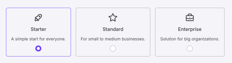
2. Custom Input Vertical
This component displays custom inputs in a vertical layout.
⚙️ Props
- data (required): The input data, which includes value, title, content, and optional asset.
- className (optional): Tailwind CSS classes to style the input.
- type (required): Defines whether the input is a checkbox or radio.
- selected (required for checkbox): An array of selected values for checkboxes.
- handleChange (required): A function to handle input changes.
👀 Preview and Code
- Preview
- Code
import { useState, type ChangeEvent } from 'react'

import { TbRocket, TbStar, TbBriefcase } from 'react-icons/tb'
import { RadioGroup } from '@repo/ui/components/ui/radio-group'
import CustomInputVertical from '@repo/ui/components/custom-inputs/Vertical'
import type { CustomInputVerticalData } from '@repo/ui/components/custom-inputs/types'

const data: CustomInputVerticalData[] = [
  {
    value: '...',
    title: '...',
    isSelected: true,
    content: '...',
    asset: <TbRocket />
  },
  ...
]

const Component = () => {
  const initialSelected: string = data.filter(item => item.isSelected)[data.filter(item => item.isSelected).length - 1]
    .value

  // States
  const [selected, setSelected] = useState<string>(initialSelected)

  const handleChange = (prop: string | ChangeEvent<HTMLInputElement>) => {
    if (typeof prop === 'string') {
      setSelected(prop)
    } else {
      setSelected((prop.target as HTMLInputElement).value)
    }
  }

  return (
    <RadioGroup className='flex gap-4'>
      {data.map((item, index) => {
        return (
          <CustomInputVertical
            type='radio'
            key={index}
            data={{ ...item }}
            selected={selected}
            handleChange={handleChange}
          />
        )
      })}
    </RadioGroup>
  )
}

export default Component
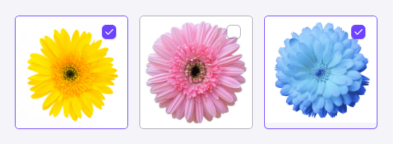
3. Custom Input Image
This component allows you to create custom input elements like checkboxes or radio buttons with images.
⚙️ Props
- data (required): The input data, which includes value, image, and optional alt text.
- className (optional): Tailwind CSS classes to style the input.
- type (required): Defines whether the input is a checkbox or radio.
- selected (required for checkbox): An array of selected values for checkboxes.
- handleChange (required): A function to handle input changes.
👀 Preview and Code
- Preview
- Code
import { useState } from 'react'

import CustomInputImage from '@repo/ui/components/custom-inputs/Image'
import type { CustomInputImageData } from '@repo/ui/components/custom-inputs/types'

const data: CustomInputImageData[] = [
  {
    value: '...',
    isSelected: true,
    img: '...'
  },
  ...
]

const Component = () => {
  const initialSelected: string[] = data.filter(item => item.isSelected).map(item => item.value)

  // States
  const [selected, setSelected] = useState<string[]>(initialSelected)

  const handleChange = (value: string) => {
    if (selected.includes(value)) {
      const updatedArr = selected.filter(item => item !== value)

      setSelected(updatedArr)
    } else {
      setSelected([...selected, value])
    }
  }

  return (
    <div className='flex gap-4'>
      {data.map((item, index) => (
        <CustomInputImage
          type='checkbox'
          key={index}
          data={{ ...item, img: item.img }}
          selected={selected}
          handleChange={handleChange}
          className='max-w-[160px]'
        />
      ))}
    </div>
  )
}

export default Component
5. Custom Image
The Custom Image component allows you to display images with different styles for light and dark modes.
⚙️ Props
- srcLight (required): The image source for light mode.
- srcDark (required): The image source for dark mode.
- alt (optional): Alt text for accessibility.
- className (optional): Tailwind CSS classes to style the image.
6. Custom Link
The Custom Link component is used for links that may or may not require interaction. It behaves like a standard Link component when an href is provided but can also be used as a non-interactive element when href is absent.
⚙️ Props
- href (optional): The destination URL for the link.
- className (optional): Tailwind CSS classes for styling the link.
- children (required): The content inside the link.
7. Loader
The Loader component is used to display a loading spinner or animation while content is being fetched or processed.
⚙️ Props
- All standard SVG props can be passed to this component, such as
width,height,stroke, etc., to customize the loader's appearance.
👀 Preview and Code
- Preview
- Code

import Loader from '@repo/ui/components/Loader'

const Component = () => {
  return <Loader />
}

export default Component
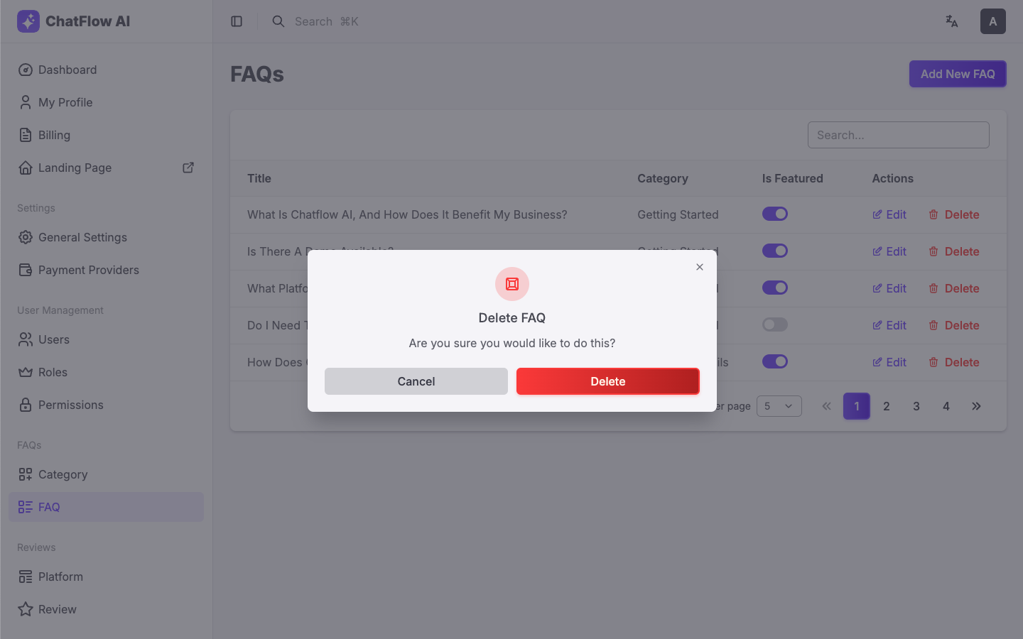
8. DeleteDialog
The DeleteDialog component is used to show a confirmation dialog before performing a delete action. It helps prevent accidental deletions by confirming the user's intention.
⚙️ Props
- handleDelete (required): A function to handle the delete action.
- variant (optional): The button style variant for the delete button (defaults to destructive).
- itemName (required): The name of the item being deleted, used in the confirmation dialog.
👀 Preview and Code
- Preview
- Code
import DeleteDialog from '@repo/ui/components/DeleteDialog'

const Component = () => {
  return (
    <DeleteDialog
      variant='ghostDestructive'
      handleDelete={async () => {
        await deleteFaq()
      }}
      itemName='FAQ'
    />
  )
}

export default Component
9. Video Dialog
The Video Dialog component displays a video thumbnail with a play button. When the play button is clicked, it opens a video dialog above the main screen to show the video. It’s ideal for showing video content in a clean and interactive way without navigating away from the current page.
⚙️ Props
- videoSrc (required): The source URL of the video to be played in the dialog.
- thumbnailSrcLight (required): The thumbnail image source for light mode.
- thumbnailSrcDark (required): The thumbnail image source for dark mode.
- thumbnailAlt (optional): Alt text for the thumbnail image for accessibility.
- thumbnailClassName (optional): Tailwind CSS classes for styling the thumbnail image.
- thumbnailDelay (optional): Delay for the thumbnail animation or appearance.
- className (optional): Tailwind CSS classes for styling the video dialog container.
👀 Preview and Code
- Preview
- Code

import VideoDialog from '@repo/ui/components/ui/video-dialog'

const Component = () => {
  return (
    <VideoDialog
      videoSrc='...'
      thumbnailSrcLight='...'
      thumbnailSrcDark='...'
      thumbnailAlt='...'
    />
  )
}

export default Component
10. Avatar Group
The Avatar Group component is used to display a group of avatars, typically used to show user profiles. You can limit the number of avatars shown, and once the limit is exceeded, it displays the remaining avatars as a collective count (e.g., "+9").
⚙️ Props
- limit (required): The maximum number of avatars to display before showing a collective count.
- avatarUrls (required): An array of avatar image URLs to display.
- size (optional): The size of the avatars, which can be one of:
- 'xs', 'sm', 'md', 'lg', 'xl', '2xl', '3xl'
- className (optional): Tailwind CSS classes for styling the avatar group container.
👀 Preview and Code
- Preview
- Code
import AvatarGroup from '@repo/ui/components/ui/avatar-group'
const avatarUrls = ['/images/avatars/1.png', '/images/avatars/2.png', '/images/avatars/3.png', '/images/avatars/4.png']

const Component = () => {
  return <AvatarGroup limit={4} avatarUrls={avatarUrls} />
}

export default Component
These Miscellaneous Components provide essential functionality that complements the core components of your project. Whether you need a section header, custom inputs, or a delete confirmation dialog, these components can be seamlessly integrated into your app. Each component is designed for maximum flexibility and customization, allowing you to tailor them to meet your specific needs.