# Card Statistics
# Overview
We have create different version of card components to make it easier for you to show your statistics neatly.
# Card Statistics Horizontal
import Icon from 'src/@core/components/icon'
import CardStatisticsHorizontal from 'src/@core/components/card-statistics/card-stats-horizontal'

const Component = () => (
  <CardStatisticsHorizontal
    stats='2,856'
    trend='negative'
    trendNumber='10.2%'
    title='New Customers'
    icon={<Icon icon='mdi:account-outline' />}
  />
)

export default Component
Result:

# Props
| Prop | Type | Required | Description |
|---|---|---|---|
| title | string | Yes | Title of the card |
| color | primary, secondary, success, error, warning, info | No | Color of the icon inside the avatar |
| icon | ReactNode | Yes | Icon inside the avatar |
| stats | string | Yes | The statistic number on the card |
| trend | positive, negative | No | To show the change in numbers than previous numbers |
| trendNumber | string | Yes | To show the difference in numbers |
# Card Statistics Vertical
import Icon from 'src/@core/components/icon'
import CardStatisticsVertical from 'src/@core/components/card-statistics/card-stats-vertical'
const Component = () => (
<CardStatisticsVertical
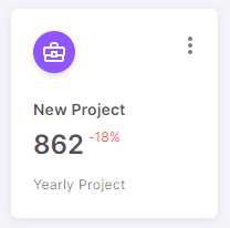
stats='862'
trend='negative'
trendNumber='-18%'
title='New Project'
subtitle='Yearly Project'
icon={<Icon icon='mdi:briefcase-variant-outline' />}
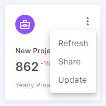
optionsMenuProps={{ options: ['Refresh', 'Share', 'Update'] }}
/>
)
export default Component
Result:
# Props
| Prop | Type | Required | Description |
|---|---|---|---|
| title | string | Yes | Title of the card |
| subtitle | string | Yes | Subtitle of the card |
| color | primary, secondary, success, error, warning, info | No | Color of the avatar |
| icon | ReactNode | Yes | Icon inside the avatar |
| stats | string | Yes | The statistic number on the card |
| trend | positive, negative | No | To show the change in numbers than previous numbers |
| trendNumber | string | Yes | To show the difference in numbers |
| optionsMenuProps | OptionsMenuType | No | Options to render in the more options menu |
# Card Statistics Image
import CardStatisticsImg from 'src/@core/components/card-statistics/card-stats-with-image'
const Component = () => (
<CardStatisticsImg
src='...'
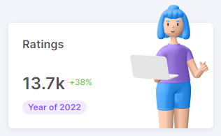
stats='13.7k'
title='Ratings'
trendNumber='+38%'
chipText={`Year of ${new Date().getFullYear()}`}
/>
)
export default Component
Result:
# Props
| Prop | Type | Required | Description |
|---|---|---|---|
| title | string | Yes | Title of the card |
| chipText | string | Yes | Label of the chip |
| chipColor | primary, secondary, success, error, warning, info | No | Color of the chip |
| src | string | Yes | Path of the image |
| stats | string | Yes | The statistic number on the card |
| trend | positive, negative | No | To show the change in numbers than previous numbers |
| trendNumber | string | Yes | To show the difference in numbers |