# Checkbox
# Overview
We have made the custom checkbox components for you to make it easy for you and you don't have to waste your precious time.
Please visit MUI Checkbox Docs (opens new window) for a proper explanation of the Checkbox component.
# Basic Custom Checkbox

Usage:
import { useState } from 'react'
import Grid from '@mui/material/Grid'
import { CustomCheckboxBasicData } from 'src/@core/components/custom-checkbox/types'
import CustomCheckboxBasic from 'src/@core/components/custom-checkbox/basic'

const data: CustomCheckboxBasicData[] = [
  {
    meta: '20%',
    isSelected: true,
    value: 'discount',
    title: 'Discount',
    content: 'Wow! Get 20% off on your next purchase!'
  },
  {
    meta: 'Free',
    value: 'updates',
    title: 'Updates',
    content: 'Get Updates regarding related products.'
  }
]

const Component = () => {
  const initialSelected: string[] = data.filter(item => item.isSelected).map(item => item.value)
  const [selected, setSelected] = useState<string[]>(initialSelected)

  const handleChange = (value: string) => {
    if (selected.includes(value)) {
      const updatedArr = selected.filter(item => item !== value)
      setSelected(updatedArr)
    } else {
      setSelected([...selected, value])
    }
  }

  return (
    <Grid container spacing={4}>
      {data.map((item, index) => (
        <CustomCheckboxBasic
          key={index}
          data={data[index]}
          selected={selected}
          handleChange={handleChange}
          name='custom-checkbox-basic'
          gridProps={{ sm: 6, xs: 12 }}
        />
      ))}
    </Grid>
  )
}

export default Component
import { useState } from 'react'
import Grid from '@mui/material/Grid'
import CustomCheckboxBasic from 'src/@core/components/custom-checkbox/basic'

const data = [
  {
    meta: '20%',
    isSelected: true,
    value: 'discount',
    title: 'Discount',
    content: 'Wow! Get 20% off on your next purchase!'
  },
  {
    meta: 'Free',
    value: 'updates',
    title: 'Updates',
    content: 'Get Updates regarding related products.'
  }
]

const Component = () => {
  const initialSelected = data.filter(item => item.isSelected).map(item => item.value)
  const [selected, setSelected] = useState(initialSelected)

  const handleChange = value => {
    if (selected.includes(value)) {
      const updatedArr = selected.filter(item => item !== value)
      setSelected(updatedArr)
    } else {
      setSelected([...selected, value])
    }
  }

  return (
    <Grid container spacing={4}>
      {data.map((item, index) => (
        <CustomCheckboxBasic
          key={index}
          data={data[index]}
          selected={selected}
          handleChange={handleChange}
          name='custom-checkbox-basic'
          gridProps={{ sm: 6, xs: 12 }}
        />
      ))}
    </Grid>
  )
}

export default Component
# Props
| Prop | Type | Required | Description |
|---|---|---|---|
| name | string | Yes | Name attribute of the checkbox |
| selected | string[] | Yes | Array of selected checkboxes |
| data | CustomCheckboxBasicData | Yes | Object to create checkbox |
| handleChange | (value: string) => void | Yes | Run a function when an option is changed |
| gridProps | GridProps | Yes | Add props of the MUI's Grid component |
| color | primary, secondary, error, warning, info, success | No | Color of the selected checkboxes |
# The type of CustomCheckboxBasicData is as follows:
| Property | Type | Required | Description |
|---|---|---|---|
| value | string | Yes | Identify a particular checkbox |
| title | ReactNode | No | Title for the checkbox component |
| meta | ReactNode | No | Add content to the right side of the title. (To add meta in your checkbox, you need to add the title property as well) |
| content | ReactNode | No | Add content below the title |
| isSelected | boolean | No | If true, checkbox will be selected at initial render |
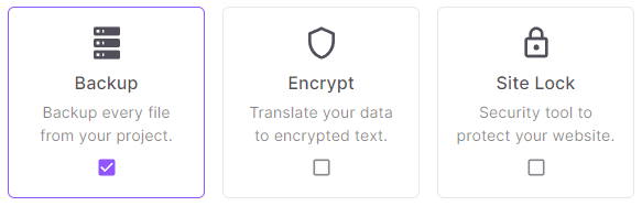
# Custom Checkbox with Icons
Usage:
import { useState } from 'react'
import Grid from '@mui/material/Grid'
import { CustomCheckboxIconsData, CustomCheckboxIconsProps } from 'src/@core/components/custom-checkbox/types'
import CustomCheckboxIcons from 'src/@core/components/custom-checkbox/icons'

interface IconType {
  icon: CustomCheckboxIconsProps['icon']
  iconProps: CustomCheckboxIconsProps['iconProps']
}

const data: CustomCheckboxIconsData[] = [
  {
    value: 'backup',
    title: 'Backup',
    isSelected: true,
    content: 'Backup every file from your project.'
  },
  {
    value: 'encrypt',
    title: 'Encrypt',
    content: 'Translate your data to encrypted text.'
  },
  {
    value: 'site-lock',
    title: 'Site Lock',
    content: 'Security tool to protect your website.'
  }
]

const icons: IconType[] = [
  { icon: 'mdi:server', iconProps: { fontSize: '2rem', style: { marginBottom: 8 } } },
  { icon: 'mdi:shield-outline', iconProps: { fontSize: '2rem', style: { marginBottom: 8 } } },
  { icon: 'mdi:lock-outline', iconProps: { fontSize: '2rem', style: { marginBottom: 8 } } }
]

const Component = () => {
  const initialSelected: string[] = data.filter(item => item.isSelected).map(item => item.value)
  const [selected, setSelected] = useState<string[]>(initialSelected)

  const handleChange = (value: string) => {
    if (selected.includes(value)) {
      const updatedArr = selected.filter(item => item !== value)
      setSelected(updatedArr)
    } else {
      setSelected([...selected, value])
    }
  }

  return (
    <Grid container spacing={4}>
      {data.map((item, index) => (
        <CustomCheckboxIcons
          key={index}
          data={data[index]}
          selected={selected}
          icon={icons[index].icon}
          handleChange={handleChange}
          name='custom-checkbox-icons'
          gridProps={{ sm: 4, xs: 12 }}
          iconProps={icons[index].iconProps}
        />
      ))}
    </Grid>
  )
}

export default Component
import { useState } from 'react'
import Grid from '@mui/material/Grid'
import CustomCheckboxIcons from 'src/@core/components/custom-checkbox/icons'

const data = [
  {
    value: 'backup',
    title: 'Backup',
    isSelected: true,
    content: 'Backup every file from your project.'
  },
  {
    value: 'encrypt',
    title: 'Encrypt',
    content: 'Translate your data to encrypted text.'
  },
  {
    value: 'site-lock',
    title: 'Site Lock',
    content: 'Security tool to protect your website.'
  }
]

const icons = [
  { icon: 'mdi:server', iconProps: { fontSize: '2rem', style: { marginBottom: 8 } } },
  { icon: 'mdi:shield-outline', iconProps: { fontSize: '2rem', style: { marginBottom: 8 } } },
  { icon: 'mdi:lock-outline', iconProps: { fontSize: '2rem', style: { marginBottom: 8 } } }
]

const Component = () => {
  const initialSelected = data.filter(item => item.isSelected).map(item => item.value)
  const [selected, setSelected] = useState(initialSelected)

  const handleChange = value => {
    if (selected.includes(value)) {
      const updatedArr = selected.filter(item => item !== value)
      setSelected(updatedArr)
    } else {
      setSelected([...selected, value])
    }
  }

  return (
    <Grid container spacing={4}>
      {data.map((item, index) => (
        <CustomCheckboxIcons
          key={index}
          data={data[index]}
          selected={selected}
          icon={icons[index].icon}
          handleChange={handleChange}
          name='custom-checkbox-icons'
          gridProps={{ sm: 4, xs: 12 }}
          iconProps={icons[index].iconProps}
        />
      ))}
    </Grid>
  )
}

export default Component
# Props
| Prop | Type | Required | Description |
|---|---|---|---|
| name | string | Yes | Name attribute of the checkbox |
| selected | string[] | Yes | Array of selected checkboxes |
| data | CustomCheckboxIconsData | Yes | Object to create checkbox |
| handleChange | (value: string) => void | Yes | Run a function when an option is changed |
| gridProps | GridProps | Yes | Add props of the MUI's Grid component |
| icon | string | No | Icon for the checkbox component |
| iconProps | Omit<IconProps, 'icon'> | No | Add props of Iconify's Icon component |
| color | primary, secondary, error, warning, info, success | No | Color of the selected checkboxes |
# The type of CustomCheckboxIconsData is as follows:
| Property | Type | Required | Description |
|---|---|---|---|
| value | string | Yes | Identify a particular checkbox |
| title | ReactNode | No | Title for the checkbox component |
| content | ReactNode | No | Add content below the title |
| isSelected | boolean | No | If true, checkbox will be selected at initial render |
# Custom Checkbox with Images

Usage:
import { useState } from 'react'
import Grid from '@mui/material/Grid'
import { CustomCheckboxImgData } from 'src/@core/components/custom-checkbox/types'
import CustomCheckboxImg from 'src/@core/components/custom-checkbox/image'

const data: CustomCheckboxImgData[] = [
  {
    value: 'clock',
    isSelected: true,
    img: '...'
  },
  {
    value: 'donuts',
    img: '...'
  },
  {
    value: 'flowers',
    img: '...'
  }
]

const Component = () => {
  const initialSelected: string[] = data.filter(item => item.isSelected).map(item => item.value)
  const [selected, setSelected] = useState<string[]>(initialSelected)

  const handleChange = (value: string) => {
    if (selected.includes(value)) {
      const updatedArr = selected.filter(item => item !== value)
      setSelected(updatedArr)
    } else {
      setSelected([...selected, value])
    }
  }

  return (
    <Grid container spacing={4}>
      {data.map((item, index) => (
        <CustomCheckboxImg
          key={index}
          data={data[index]}
          selected={selected}
          name='custom-checkbox-img'
          handleChange={handleChange}
          gridProps={{ sm: 4, xs: 12 }}
        />
      ))}
    </Grid>
  )
}

export default Component
import { useState } from 'react'
import Grid from '@mui/material/Grid'
import CustomCheckboxImg from 'src/@core/components/custom-checkbox/image'

const data = [
  {
    value: 'clock',
    isSelected: true,
    img: '...'
  },
  {
    value: 'donuts',
    img: '...'
  },
  {
    value: 'flowers',
    img: '...'
  }
]

const Component = () => {
  const initialSelected = data.filter(item => item.isSelected).map(item => item.value)
  const [selected, setSelected] = useState(initialSelected)

  const handleChange = value => {
    if (selected.includes(value)) {
      const updatedArr = selected.filter(item => item !== value)
      setSelected(updatedArr)
    } else {
      setSelected([...selected, value])
    }
  }

  return (
    <Grid container spacing={4}>
      {data.map((item, index) => (
        <CustomCheckboxImg
          key={index}
          data={data[index]}
          selected={selected}
          name='custom-checkbox-img'
          handleChange={handleChange}
          gridProps={{ sm: 4, xs: 12 }}
        />
      ))}
    </Grid>
  )
}

export default Component
# Props
| Prop | Type | Required | Description |
|---|---|---|---|
| name | string | Yes | Name attribute of the checkbox |
| selected | string[] | Yes | Array of selected checkboxes |
| data | CustomCheckboxImgData | Yes | Object to create checkbox |
| handleChange | (value: string) => void | Yes | Run a function when an option is changed |
| gridProps | GridProps | Yes | Add props of the MUI's Grid component |
| color | primary, secondary, error, warning, info, success | No | Color of the selected checkboxes |
# The type of CustomCheckboxImgData is as follows:
| Property | Type | Required | Description |
|---|---|---|---|
| value | string | Yes | Identify a particular checkbox |
| img | ReactNode | Yes | Image for the checkbox |
| alt | string | No | Alternate text for the image |
| isSelected | boolean | No | If true, checkbox will be selected at initial render |