# Option Menu
# Overview
Use this component to add an IconButton (opens new window) which opens a menu/dropdown (opens new window). You can use it anywhere in your project.
# Usage
import Typography from '@mui/material/Typography'
import Icon from 'src/@core/components/icon'
import OptionsMenu from 'src/@core/components/option-menu'

const SomeComponent = () => {
  return (
    <OptionsMenu
      icon={<Icon icon='mdi:chevron-down' />}
      iconButtonProps={{ size: 'small', sx: { color: 'text.secondary' } }}
      options={[
        {
          icon: <Icon icon='mdi:send' />,
          text: <Typography>Send</Typography>,
          menuItemProps: { sx: { '& svg': { mr: 2, color: 'text.secondary' } } }
        },
        { text: 'Styled Item', menuItemProps: { sx: { color: 'error.main' } } },
        { divider: true, dividerProps: { sx: { m: '0 !important' } } },
        { text: 'Item with Object' },
        { text: 'Selected Menu', menuItemProps: { selected: true } },
        'Item with String',
        { text: 'Disabled Menu', menuItemProps: { disabled: true } }
      ]}
    />
  )
}

export default SomeComponent
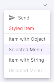
Result:
# Props
| Props | Type | Required | Description |
|---|---|---|---|
| options | OptionType[] | Yes | Add all the menu items |
| icon | ReactNode | No | Change the icon in the MUI's IconButton component |
| menuProps | MenuProps | No | Add props of the MUI's Menu component |
| leftAlignMenu | boolean | No | If true, menu will align to left side |
| iconButtonProps | IconButtonProps | No | Add props of the MUI's IconButton component |
| iconProps | SvgIconProps | No | Add props of the icon component |
# The type of OptionType is either:
string
OR
| Props | Type | Required | Description |
|---|---|---|---|
| divider | boolean | Yes | To add a separator in the menu |
| dividerProps | DividerProps | No | Add props of the MUI's Divider component |
OR
| Props | Type | Required | Description |
|---|---|---|---|
| text | ReactNode | Yes | The text inside a menu item |
| icon | ReactNode | No | To add an icon in a menu item |
| menuItemProps | MenuItemProps | No | Add props of the MUI's MenuItem component |