# Radio
# Overview
We have made the custom radio components for you to make it easy for you and you don't have to waste your precious time.
Please visit MUI Radio Docs (opens new window) for a proper explanation of the Radio component.
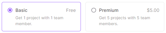
# Basic Custom Radio
Usage:
import { ChangeEvent, useState } from 'react'
import Grid from '@mui/material/Grid'
import { CustomRadioBasicData } from 'src/@core/components/custom-radio/types'
import CustomRadioBasic from 'src/@core/components/custom-radio/basic'

const data: CustomRadioBasicData[] = [
  {
    meta: 'Free',
    title: 'Basic',
    value: 'basic',
    isSelected: true,
    content: 'Get 1 project with 1 team member.'
  },
  {
    meta: '$5.00',
    title: 'Premium',
    value: 'premium',
    content: 'Get 5 projects with 5 team members.'
  }
]

const Component = () => {
  const initialSelected: string = data.filter(item => item.isSelected)[data.filter(item => item.isSelected).length - 1]
    .value
  const [selected, setSelected] = useState<string>(initialSelected)

  const handleChange = (prop: string | ChangeEvent<HTMLInputElement>) => {
    if (typeof prop === 'string') {
      setSelected(prop)
    } else {
      setSelected((prop.target as HTMLInputElement).value)
    }
  }

  return (
    <Grid container spacing={4}>
      {data.map((item, index) => (
        <CustomRadioBasic
          key={index}
          data={data[index]}
          selected={selected}
          name='custom-radios-basic'
          handleChange={handleChange}
          gridProps={{ sm: 6, xs: 12 }}
        />
      ))}
    </Grid>
  )
}

export default Component
import { useState } from 'react'
import Grid from '@mui/material/Grid'
import CustomRadioBasic from 'src/@core/components/custom-radio/basic'

const data = [
  {
    meta: 'Free',
    title: 'Basic',
    value: 'basic',
    isSelected: true,
    content: 'Get 1 project with 1 team member.'
  },
  {
    meta: '$5.00',
    title: 'Premium',
    value: 'premium',
    content: 'Get 5 projects with 5 team members.'
  }
]

const Component = () => {
  const initialSelected = data.filter(item => item.isSelected)[data.filter(item => item.isSelected).length - 1].value
  const [selected, setSelected] = useState(initialSelected)

  const handleChange = prop => {
    if (typeof prop === 'string') {
      setSelected(prop)
    } else {
      setSelected(prop.target.value)
    }
  }

  return (
    <Grid container spacing={4}>
      {data.map((item, index) => (
        <CustomRadioBasic
          key={index}
          data={data[index]}
          selected={selected}
          name='custom-radios-basic'
          handleChange={handleChange}
          gridProps={{ sm: 6, xs: 12 }}
        />
      ))}
    </Grid>
  )
}

export default Component
# Props
| Prop | Type | Required | Description |
|---|---|---|---|
| name | string | Yes | Name attribute of the radio |
| selected | string | Yes | Selected radio |
| data | CustomRadioBasicData | Yes | Object to create radio |
| handleChange | (prop: string | ChangeEvent<HTMLInputElement>) => void | Yes | Run a function when an option is changed |
| gridProps | GridProps | Yes | Add props of the MUI's Grid component |
| color | primary, secondary, error, warning, info, success | No | Color of the selected radios |
# The type of CustomRadioBasicData is as follows:
| Property | Type | Required | Description |
|---|---|---|---|
| value | string | Yes | Identify a particular radio |
| title | ReactNode | No | Title for the radio component |
| meta | ReactNode | No | Add content to the right side of the title. (To add meta in your radio, you need to add the title property as well) |
| content | ReactNode | No | Add content below the title |
| isSelected | boolean | No | If true, the radio will be selected at the initial render |
# Custom Radio with Icons
Usage:
import { ChangeEvent, useState } from 'react'
import Grid from '@mui/material/Grid'
import { CustomRadioIconsData, CustomRadioIconsProps } from 'src/@core/components/custom-radio/types'
import CustomRadioIcons from 'src/@core/components/custom-radio/icons'

interface IconType {
  icon: CustomRadioIconsProps['icon']
  iconProps: CustomRadioIconsProps['iconProps']
}

const data: CustomRadioIconsData[] = [
  {
    value: 'starter',
    title: 'Starter',
    isSelected: true,
    content: 'A simple start for everyone.'
  },
  {
    value: 'standard',
    title: 'Standard',
    content: 'For small to medium businesses.'
  },
  {
    value: 'enterprise',
    title: 'Enterprise',
    content: 'Solution for big organizations.'
  }
]

const icons: IconType[] = [
  { icon: 'mdi:rocket-launch-outline', iconProps: { fontSize: '2rem', style: { marginBottom: 8 } } },
  { icon: 'mdi:account-outline', iconProps: { fontSize: '2rem', style: { marginBottom: 8 } } },
  { icon: 'mdi:crown-outline', iconProps: { fontSize: '2rem', style: { marginBottom: 8 } } }
]

const Component = () => {
  const initialSelected: string = data.filter(item => item.isSelected)[data.filter(item => item.isSelected).length - 1]
    .value
  const [selected, setSelected] = useState<string>(initialSelected)

  const handleChange = (prop: string | ChangeEvent<HTMLInputElement>) => {
    if (typeof prop === 'string') {
      setSelected(prop)
    } else {
      setSelected((prop.target as HTMLInputElement).value)
    }
  }

  return (
    <Grid container spacing={4}>
      {data.map((item, index) => (
        <CustomRadioIcons
          key={index}
          data={data[index]}
          selected={selected}
          icon={icons[index].icon}
          name='custom-radios-icons'
          handleChange={handleChange}
          gridProps={{ sm: 4, xs: 12 }}
          iconProps={icons[index].iconProps}
        />
      ))}
    </Grid>
  )
}

export default Component
import { useState } from 'react'
import Grid from '@mui/material/Grid'
import CustomRadioIcons from 'src/@core/components/custom-radio/icons'

const data = [
  {
    value: 'starter',
    title: 'Starter',
    isSelected: true,
    content: 'A simple start for everyone.'
  },
  {
    value: 'standard',
    title: 'Standard',
    content: 'For small to medium businesses.'
  },
  {
    value: 'enterprise',
    title: 'Enterprise',
    content: 'Solution for big organizations.'
  }
]

const icons = [
  { icon: 'mdi:rocket-launch-outline', iconProps: { fontSize: '2rem', style: { marginBottom: 8 } } },
  { icon: 'mdi:account-outline', iconProps: { fontSize: '2rem', style: { marginBottom: 8 } } },
  { icon: 'mdi:crown-outline', iconProps: { fontSize: '2rem', style: { marginBottom: 8 } } }
]

const Component = () => {
  const initialSelected = data.filter(item => item.isSelected)[data.filter(item => item.isSelected).length - 1].value
  const [selected, setSelected] = useState(initialSelected)

  const handleChange = prop => {
    if (typeof prop === 'string') {
      setSelected(prop)
    } else {
      setSelected(prop.target.value)
    }
  }

  return (
    <Grid container spacing={4}>
      {data.map((item, index) => (
        <CustomRadioIcons
          key={index}
          data={data[index]}
          selected={selected}
          icon={icons[index].icon}
          name='custom-radios-icons'
          handleChange={handleChange}
          gridProps={{ sm: 4, xs: 12 }}
          iconProps={icons[index].iconProps}
        />
      ))}
    </Grid>
  )
}

export default Component
# Props
| Prop | Type | Required | Description |
|---|---|---|---|
| name | string | Yes | Name attribute of the radio |
| selected | string | Yes | Selected radio |
| data | CustomRadioIconsData | Yes | Object to create radio |
| handleChange | (prop: string | ChangeEvent<HTMLInputElement>) => void | Yes | Run a function when an option is changed |
| gridProps | GridProps | Yes | Add props of the MUI's Grid component |
| icon | string | No | Icon for the radio component |
| iconProps | Omit<IconProps, 'icon'> | No | Add props of Iconify's Icon component |
| color | primary, secondary, error, warning, info, success | No | Color of the selected radios |
# The type of CustomRadioIconsData is as follows:
| Property | Type | Required | Description |
|---|---|---|---|
| value | string | Yes | Identify a particular radio |
| title | ReactNode | No | Title for the radio component |
| content | ReactNode | No | Add content below the title |
| isSelected | boolean | No | If true, the radio will be selected at the initial render. (If multiple radios are selected, then it is up to the user how to handle them) |
# Custom Radio with Images

Usage:
import { ChangeEvent, useState } from 'react'
import Grid from '@mui/material/Grid'
import { CustomRadioImgData } from 'src/@core/components/custom-radio/types'
import CustomRadioImg from 'src/@core/components/custom-radio/image'

const data: CustomRadioImgData[] = [
  {
    value: 'clock',
    isSelected: true,
    img: '...'
  },
  {
    value: 'donuts',
    img: '...'
  },
  {
    value: 'flowers',
    img: '...'
  }
]

const Component = () => {
  const initialSelected: string = data.filter(item => item.isSelected)[data.filter(item => item.isSelected).length - 1]
    .value
  const [selected, setSelected] = useState<string>(initialSelected)

  const handleChange = (prop: string | ChangeEvent<HTMLInputElement>) => {
    if (typeof prop === 'string') {
      setSelected(prop)
    } else {
      setSelected((prop.target as HTMLInputElement).value)
    }
  }

  return (
    <Grid container spacing={4}>
      {data.map((item, index) => (
        <CustomRadioImg
          key={index}
          data={data[index]}
          selected={selected}
          name='custom-radios-img'
          handleChange={handleChange}
          gridProps={{ sm: 4, xs: 12 }}
        />
      ))}
    </Grid>
  )
}

export default Component
import { useState } from 'react'
import Grid from '@mui/material/Grid'
import CustomRadioImg from 'src/@core/components/custom-radio/image'

const data = [
  {
    value: 'clock',
    isSelected: true,
    img: '...'
  },
  {
    value: 'donuts',
    img: '...'
  },
  {
    value: 'flowers',
    img: '...'
  }
]

const Component = () => {
  const initialSelected = data.filter(item => item.isSelected)[data.filter(item => item.isSelected).length - 1].value
  const [selected, setSelected] = useState(initialSelected)

  const handleChange = prop => {
    if (typeof prop === 'string') {
      setSelected(prop)
    } else {
      setSelected(prop.target.value)
    }
  }

  return (
    <Grid container spacing={4}>
      {data.map((item, index) => (
        <CustomRadioImg
          key={index}
          data={data[index]}
          selected={selected}
          name='custom-radios-img'
          handleChange={handleChange}
          gridProps={{ sm: 4, xs: 12 }}
        />
      ))}
    </Grid>
  )
}

export default Component
# Props
| Prop | Type | Required | Description |
|---|---|---|---|
| name | string | Yes | Name attribute of the radio |
| selected | string | Yes | Selected radio |
| data | CustomRadioImgData | Yes | Object to create radio |
| handleChange | (prop: string | ChangeEvent<HTMLInputElement>) => void | Yes | Run a function when an option is changed |
| gridProps | GridProps | Yes | Add props of the MUI's Grid component |
| color | primary, secondary, error, warning, info, success | No | Color of the selected radios |
# The type of CustomRadioImgData is as follows:
| Property | Type | Required | Description |
|---|---|---|---|
| value | string | Yes | Identify a particular radio |
| img | ReactNode | Yes | Image for the radio |
| alt | string | No | Alternate text for the image |
| isSelected | boolean | No | If true, the radio will be selected at the initial render |
← Option Menu Checkbox →